
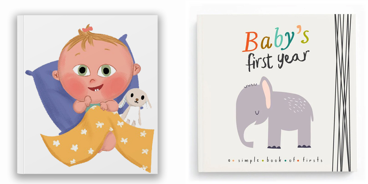
Great Book Covers act as magical gateways, sparking a child’s imagination and compelling them to pick up the story. They use striking visuals, child‑friendly typography, and a captivating color scheme to convey the plot and mood in a glance. Strong book cover design boosts recognition, supports marketing, and makes a lasting impression on young readers’ memories. In this guide, we’ll explore the essential elements—clarity, typography, imagery, composition, and genre alignment—that transform a cover into one of the best book covers children can’t resist.
Clarity & Simplicity
A child should instantly grasp what the story is about. Avoid overcrowding with too many visual elements or complex narratives; simplicity is power for young minds (turn0search1). Use negative space strategically to draw attention. A good book cover quickly communicates character or setting—like a playful dragon or cozy forest—without overwhelming the reader.
Strong Typography
Clear, playful fonts are a hallmark of children’s book covers design. The title should be readable at thumbnail size and reflect the story’s tone—whimsical for bedtime tales, bold for adventures. Complement text hierarchy with subtitle and author name in supporting fonts (turn0search5). Well-chosen fonts elevate book cover design from ordinary to enchanting.
Compelling Imagery
Illustrations resonate deeply with children. Whether it’s a cartoon animal or a gentle monster, visuals must be relatable and imaginative. Avoid generic stock images; children respond to expressive, custom art that reflects their world (turn0search5). A color scheme Psychology tied to the imagery reinforces narrative mood—from sunny yellow for happy tales to calming blue for bedtime stories.
Effective Color Scheme
Color sets the emotional tone. Bright, bold palettes catch children’s eyes, especially in digital thumbnails (turn0search2, turn0search3). For toddlers, saturated primary colors work best; for older kids, consider gentle pastels or theme‑based palettes. Use color theory: green for nature, red for energy, and purple for fantasy. A cohesive color scheme ties together text, background, and artwork.
Read More:Common Mistakes to Avoid in Fantasy Book Cover Design
Strong Composition & Focal Point
Great covers employ the rule of thirds, placing key elements—like a knight or magic castle—at intersection points to draw attention. Balance illustrations with text, ensuring each has space to breathe. A strong focal point tells a story in a snapshot, immediately engaging a child. Clean composition underpins expert book cover design.
Attention to Detail
Fine details—texture, illustrative layering, lighting—add polish and depth. For children’s covers, textures make surfaces tactile, while shading adds dimension without overwhelming. A sandcastle might sparkle; a forest scene might glow. These nuances elevate a cover from good to exceptional, enhancing the reading experience even before the first page.
Genre Awareness
Children’s fantasy books demand certain visual cues magical creatures, vibrant color palettes, and whimsical fonts. A mismatched cover, such as dark noir fonts on a unicorn tale, confuses readers. By signaling genre correctly, a cover sets expectations and builds trust with your audience (turn0search0, turn0search11).
Bring Your Children’s Story to Life with Fantasy Book Cover Design
Partner with talented Book illustrators who specialize in creating lovable characters and enchanting scenes for picture books and early readers.
Testing for Thumbnails
Most book discovery happens on screens—so test your cover as a 200 px thumbnail. If the title text or character is lost, simplify the layout or increase contrast. A compelling thumbnail can sway a parent’s purchase decision or a child’s choice. Always preview book cover design across devices to ensure clarity.
Uniqueness & Identity
The best covers balance creativity with genre clarity. Iconic designers—like Fred Marcellino and Leo & Diane Dillon—blend metaphorical art with whimsical charm (turn0search26, turn0search29). Their covers feel fresh yet familiar, setting their books apart. Strive for a unique visual identity—a signature color scheme or character motif—that can carry through a series.
Visual Storytelling for Fantasy Books
Fantasy covers benefit from cues that emphasize world-building—floating islands, magic sparks, or whimsical beasts. A single lantern-lit doorway can hint at adventure. The key is storytelling through visuals alone, painting a scene that invites exploration. A cover’s imagery should ignite curiosity and open worlds, not just decorate them.
What is the best color choice for a book cover?
There isn’t a single “best” color that works for every book cover. The ideal color depends on the book’s genre, mood, and target audience. Colors send emotional signals to readers before they even read the title, which is why choosing the right palette matters.
How Colors Influence Book Cover Appeal
Each color communicates something different:
- Red: Bold, exciting, intense. Best for thrillers, action, and dramatic romance.
- Blue: Calm, trustworthy, thoughtful. Works well for nonfiction, biographies, self-help, and business books.
- Yellow: Cheerful, youthful, optimistic. Good for children’s books and positive self-help topics.
- Black: Mysterious, powerful, elegant. Popular for mystery, luxury-themed books, and serious nonfiction.
- Green: Natural, peaceful, or fresh. Perfect for wellness, environment, spirituality, and self-growth books.
- Pink/Purple: Creative, romantic, imaginative. Fits romance, fantasy, and teen fiction.
Things to Consider When Choosing a Book Cover Color
- Genre expectations: Readers naturally associate specific colors with categories. Matching those expectations helps a book feel “right.”
- Audience age group: Brighter colors attract children, while muted tones speak to adults.
- Contrast with text: Make sure titles and author names are readable. Dark text on light colors (or vice versa) is usually safer.
- Branding consistency: If the author has a series or personal brand, colors should align across all titles.
Simple Tip
If you’re unsure, create two or three color variations and test them with your target audience. Sometimes small changes, such as tone or contrast, make a big difference.
What Does a Good Book Cover Look Like?
A good book cover is more than just an attractive image—it’s the first impression your book makes on a potential reader. It should grab attention, convey the book’s theme, and make the reader curious enough to pick it up or click on it online. But what exactly makes a book cover “good”? Let’s break it down.
Clear and Readable Title
The title is the most important element of a book cover. A good cover uses a font that is easy to read, even in thumbnail size on online stores. The author’s name should also be visible but not overpower the title.
Appealing Imagery
Images or illustrations on a good book cover should reflect the genre and mood of the book. For example, a mystery novel might use dark, moody visuals, while a children’s book may feature bright, playful illustrations. The image should complement the title, not distract from it.
Appropriate Color Scheme
Colors play a huge role in attracting readers. Bright, contrasting colors catch the eye, while muted or soft tones can communicate sophistication or calmness. The color palette should align with the story’s tone and genre.
Genre-Consistency
Readers often judge a book by its cover, especially when browsing online. A good book cover should signal its genre clearly. Romance covers often have soft, warm colors; thrillers tend to use darker, high-contrast designs. This helps target the right audience instantly.
Balanced Design
A well-designed cover balances text, images, and white space. It shouldn’t feel cluttered or crowded. A clean, organized layout ensures that all key elements—title, author, and imagery—stand out.
Unique and Memorable
Finally, a good book cover is unique and memorable. It should stand out from similar books on the shelf or in search results. Whether through a creative illustration, bold typography, or an interesting composition, a cover that sticks in the reader’s mind can make a big difference in sales.
Real-World Examples
- If Animals Kissed Good Night uses friendly illustrations and soothing tones to convey bedtime calm (turn0search1).
- The Paper Bag Princess features simple, bold art and energetic typography—classic elements of Great Book Covers for young readers.
- Green by Laura Vaccaro Seeger uses minimal images and bright greens to make color itself the storytelling focus (turn0search27).
Practical Tips for Authors & Designers
- Define your audience’s age and reading level to guide font and imagery choices.
- Create mood boards with similar titles to identify common color schemes and layouts.
- Sketch concepts and test as thumbnails before committing to final art.
- Use color palettes that reflect the story’s mood and age group.
- Maintain negative space to avoid visual overload.
- Iterate based on real feedback from children and parents.
Conclusion:
A truly Great Book Cover for children combines clarity, charm, and careful crafting. By focusing on readability, cohesive color scheme, engaging illustrations, and genre-appropriate visuals, you attract and delight young readers instantly. Balance simplicity with detail, test across formats, and strive for unique design that tells a story at a glance. With these principles, your cover can become one of the best book covers children remember—and cherish—for years. So if you need a fantasy book cover design then contact The Rainbow Stories.
Frequently Ask Questions
What are the key elements of a great book cover?
A great book cover combines eye-catching visuals, clear typography, and colors that reflect the book’s theme or genre. It should also spark curiosity and stand out on shelves or online.
How important is the color choice for a book cover?
Color choice is crucial as it sets the tone and mood of the book. Bold, contrasting colors can attract attention, while muted tones may suit more serious or subtle content.
Does the book cover affect sales?
Yes. A well-designed cover can increase interest and encourage readers to pick up or click on the book, making it a key factor in marketing and first impressions.
Should a book cover reflect the story inside?
Absolutely. A cover should give readers a hint of the book’s genre, mood, or main theme, creating an accurate expectation without giving away too much.
Can a minimalist design work for a book cover?
Yes. Minimalist covers can be very effective if they are striking, clear, and memorable. Sometimes simplicity makes a stronger impression than overly complex designs.


