Picture books rely heavily on visuals to communicate meaning before words ever come into play. For young readers, color is often the very first element that captures attention. Before children understand narration or dialogue, their eyes are drawn to brightness, contrast, and emotional tones. Strategic color use allows illustrators and authors to guide focus, support storytelling flow, and clarify narrative structure. When used intentionally, color becomes a silent guide that directs the reader toward main characters, key emotions, and important story moments.
Understanding how to use color effectively in picture books transforms illustrations from decorative art into purposeful narrative tools. It helps children follow visual sequences, recognize emotional cues, and stay engaged with each page.
Understanding Visual Attention in Children
Children experience picture books very differently from adults because their visual processing skills are still developing. Their brains respond quickly to visual stimuli and instinctively gravitate toward bold shapes, bright colors, and strong contrast. Rather than analyzing composition or written text first, young readers focus on elements that stand out visually. Most commonly, their attention is drawn to saturated colors, expressive faces, animated characters, distinct high-contrast shapes, and any imagery that suggests movement or action within a scene.
Unlike adults, children do not naturally follow structured reading directions across a page. Their gaze moves freely until something emotionally or visually engaging captures attention. Without careful planning of color and contrast, illustrations can become cluttered or confusing, leaving children unsure where to look first. Strategic use of color helps organize visual flow by gently guiding young eyes toward the most important characters, actions, or story moments. Color contrast, saturation, and placement work together to establish focal points that support narrative clarity.
Children also respond emotionally to color much faster than to facial expressions or dialogue. Color becomes a primary emotional guide, communicating mood and storytelling cues instantly. Warm, bright hues signal excitement or joy, darker shades suggest tension or seriousness, and softer cool tones convey calmness or comfort. Through these emotional signals, color directs which characters to follow and how each scene should feel, supporting comprehension long before children can interpret written language.
Also Read:The Psychology of Color in Kids’ Storybooks
Why Color Is One of the Most Powerful Attention Guides
Color functions as a powerful attention magnet. The human brain is biologically wired to detect brightness and contrast first. For children especially, color acts almost like an emotional beacon—drawing the eye toward focal points even before shape or detail registers.
Three major elements give color its guiding power:
Contrast
High contrast pulls immediate attention. A vibrant character standing in front of a muted background naturally becomes the visual focal point.
Brightness and Saturation
Bright and heavily saturated areas stand forward visually, while subdued colors gently fade backward.
Emotional Resonance
Warm colors stimulate excitement; cool tones calm and stabilize focus. Emotional responses strengthen attention duration.
The brain associates color with importance. The more visually prominent something appears, the more likely it is to carry narrative meaning.
Also Read:Color Trends in Children’s Book Illustration Today
Basic Color Principles That Direct Focus
1. Contrast
Contrast is the most effective attention-directing tool. When light hues sit against dark backgrounds—or vice versa—the object becomes visually dominant. Complementary color contrast (such as red against green or blue against orange) also sharpens focus dramatically.
Illustrators frequently use contrast to spotlight primary characters while reducing distraction from backgrounds or minor elements.
2. Saturation
Highly saturated colors draw attention immediately. These are ideal for main characters, action points, or emotional highlights. Meanwhile, softer tones belong in background scenery and secondary objects to maintain balance.
Controlling saturation prevents overstimulation while preserving focus clarity.
3. Warm vs Cool Colors
Warm colors—reds, oranges, and yellows—visually move forward and attract immediate attention. Cool colors—such as blues and greens—create depth and relaxation, allowing backgrounds to support the story quietly without competing for attention.
4. Color Isolation
Using one bold color against a backdrop of neutral tones isolates the focal point dramatically. This technique is commonly used to guide the eye directly to a character or object of emotional significance.
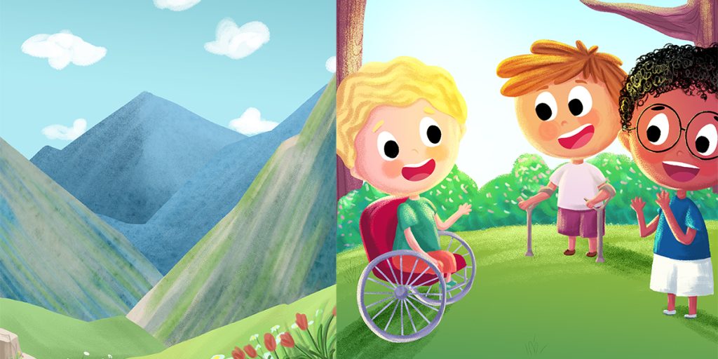
Using Color to Highlight Characters
In picture books, characters act as emotional anchors for young readers. Children naturally connect to story figures before fully understanding narrative details, which makes visual recognition essential. Maintaining consistent color palettes for main characters helps children quickly identify heroes, companions, and important figures—even when settings, lighting, or scenes change. Color becomes a visual shortcut that reinforces familiarity and emotional connection.
Illustrators commonly highlight characters through several effective techniques. Assigning each major character a unique color theme gives them immediate visual identity. Dressing protagonists in brighter or warmer hues ensures they stand out from supporting characters and backgrounds. Adding memorable accent colors through clothing accessories such as scarves, hats, backpacks, or distinctive footwear strengthens visibility without overwhelming the design. These accent details remain consistent throughout the story so children instinctively recognize characters from page to page.
For example, a central hero may always appear in a vibrant red jacket while background characters remain dressed in neutral or muted tones. Even in visually busy scenes, this contrast instantly pulls attention to the main figure and maintains narrative clarity. The viewer’s eye automatically follows the brightest or warmest color, ensuring that storytelling focus never drifts.
Repetition of character color themes further strengthens emotional recognition. Over time, children mentally link a specific color to a specific personality or role within the story. This association builds consistency, affection, and trust, helping children emotionally track character journeys throughout the book. Color thus becomes more than decoration—it becomes a dependable storytelling tool that supports emotional engagement and clear narrative focus for developing readers.
Also Read:Color Mistakes to Avoid When Designing a Children’s Book
Coloring Background vs Foreground
Separation of foreground and background is essential for depth and clarity. Muted or cool-toned backgrounds push scenery backward visually, allowing foreground characters to stand out clearly.
Effective approaches include:
- Desaturated background landscapes
- Soft watercolor textures for scenery
- Atmospheric color fogging toward page edges
Foreground characters receive stronger saturation or warmer tones, naturally guiding attention to story action rather than decorative details.
Guiding the Reading Flow Across the Page
Color can direct eye movement across a page, helping children follow storytelling sequences naturally.
Color sequencing techniques include:
- Gradually shifting brightness across scenes
- Placing repeated color cues leading left-to-right
- Creating visual rhythm using patterned accent colors
For example, a trail of yellow butterflies leading across the page urges children’s eyes forward. Similarly, changes from warm to cooler tones can guide transitions between story chapters or scenes.
Effective color mapping ensures that the visual journey supports the narrative arc instead of competing with it.
Emotional Direction Through Color
Colors also communicate emotional changes throughout storytelling.
- Warm colors express excitement, confidence, or action
- Dark or muted shades suggest tension or sadness
- Cool pastel hues create calmness or comfort
As scenes shift emotionally, color palettes can shift accordingly. A conflict moment may involve darker shades, while resolution scenes introduce brighter or softer tones for emotional closure.
This subconscious guidance helps children emotionally follow story progression even without reading comprehension.
Age-Appropriate Use of Color
Toddlers (0–3 Years)
High-contrast designs using primary colors support recognition of shapes and simple focus.
Preschoolers (3–5 Years)
Bright but balanced palettes enhance curiosity while teaching emotional differentiation.
Early Readers (6–8 Years)
Moderated tones introduce subtle mood shifts and deeper emotional storytelling.
Middle Grade (9+)
Muted palettes and symbolic color use allow for abstract emotional interpretation.
Each age group responds best to palette complexity that matches cognitive development.
Avoiding Overstimulation
Too many saturated colors can overwhelm young readers and reduce attention.
Best practices include:
- Limiting bright colors per page
- Maintaining neutral space for visual rest
- Keeping focus clusters small and intentional
Neutral backgrounds or gentle white spacing act as visual breathing areas that reduce overload while sustaining attention levels.
Digital vs Print Considerations
With increased digital reading, color usage must perform well on screens and in print.
Digital adjustments include:
- Reduced saturation to avoid glare
- Flat colors instead of heavy textures
- Testing palettes on tablets and phones
Print books maintain richer textures but still require balance for eye comfort.
Consistency across formats ensures unified storytelling experiences regardless of medium.
Practical Tips for Authors & Illustrators
- Plan emotional arcs before color selection.
- Test contrast levels for accessibility.
- Limit saturated hues to key storytelling moments.
- Assign consistent palettes to main characters.
- Preview pages in grayscale to confirm clarity.
Common Mistakes to Avoid
- Using saturation everywhere—no focal hierarchy
- Poor background-text contrast
- Ignoring emotional context in color selection
- Following trends instead of story needs
Each mistake weakens visual storytelling clarity.
Mini Case Examples
Before
Every character on a page uses bright colors; children struggle to identify who matters most.
After
The main character dressed in bright yellow against a soft teal background—the child’s attention locks instantly on the hero.
Conclusion
Learning how to use color to guide attention in picture books empowers illustrators and authors to shape storytelling visually. At The Rainbow Stories, we focus on contrast management, palette isolation, saturation control, and emotional color mapping to direct young readers toward key moments without overwhelming their senses. Color becomes a silent guide that supports storytelling flow, emotional connection, and reading comprehension.
Intentional color design transforms illustrations into communicative tools, not just decorative visuals, creating stories that children follow instinctively and remember emotionally long after closing the book.
Frequently Ask Questions
Can color alone guide attention?
Yes, when paired with contrast and saturation control.
What colors work best for main characters?
Warm hues like red, yellow, or orange are most effective.
Should color styles change by age group?
Absolutely—palette complexity must match developmental stages.
How many colors per page work best?
Typically 3–5 dominant hues to maintain clarity.