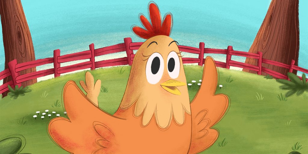
In the colorful world of children’s storytelling, consistency is the glue that holds a visual narrative together. Whether you’re illustrating a single storybook or an entire series, maintaining harmony in design, props, and colors is key to making your art feel professional, memorable, and emotionally engaging. This is where character design for children’s books becomes more than drawing cute faces it’s about building a consistent visual language that supports your story from start to finish.
Why Consistency Matters in Children’s Book Illustration
Every child remembers a favorite story not just for its words but for its visuals—the way the characters look, the world they live in, and the colors that set the mood. When those elements stay consistent across pages, they create a sense of comfort and connection for the reader. Consistency also helps illustrators maintain clarity in storytelling.
For example, a character’s hairstyle, outfit, or favorite toy shouldn’t randomly change from one page to another unless it’s part of the story. Consistency helps young readers identify with the characters and follow the plot effortlessly.
That’s why professional illustrators use three essential tools: character sheets, props, and color palettes. Together, they ensure your illustrations look cohesive and well-planned.
Character Sheets: The Foundation of Visual Continuity
When creating character sheets for illustrators, think of them as the visual blueprint for your story’s heroes and supporting cast. A character sheet includes different poses, facial expressions, clothing variations, and sometimes even emotional reactions.
It’s not just for reference it’s a consistency tracker. When you draw a character multiple times, a detailed sheet ensures their proportions, hairstyles, and accessories remain identical throughout the book.
A strong character design for children’s books starts here. For instance, if your main character is a curious fox wearing a blue scarf, the sheet should capture how that scarf looks in various angles front, side, and back views. Include sketches of emotions like joy, surprise, or sadness. This makes future illustrations smoother, saves time, and keeps readers fully immersed in the story.
Pro Tip: Label every detail color codes, materials, patterns, and even small props your character carries. It’s your artistic memory bank for long projects or sequels.
Using Props in Picture Book Art: Bringing Worlds to Life
Props might seem secondary, but they play a crucial role in storytelling. From a child’s favorite teddy bear to a spaceship, props make the story world believable. In using props in picture book art, consistency ensures that every item supports the plot and maintains visual accuracy.
Props often reflect a character’s personality or growth. For example, a young wizard’s wand might evolve in design as the story progresses, but the core elements should remain recognizable. Similarly, recurring objects like a pet’s collar, a magic key, or a school bag must look identical throughout all pages.
Props can also enhance emotional storytelling. Imagine a series of illustrations showing a little girl’s red balloon across different scenes it becomes a silent narrator of her feelings.
Design Tip: Maintain a prop library alongside your character sheets. Sketch each prop with notes on scale, material, and usage context. This small effort will save hours during final illustration and revisions.
Illustration Color Palettes: The Emotional Anchor of Your Story
Color is one of the most powerful storytelling tools in any art form. Choosing the right illustration color palettes sets the tone and emotion of your book. A well-defined palette ties your characters, props, and backgrounds together visually.
In character design for children’s books, color consistency ensures that readers instantly recognize the main character, even in different settings. For example, keeping your protagonist’s outfit in a consistent shade of blue builds identity and familiarity.
Different colors also evoke emotions:
- Warm colors (reds, oranges, yellows) convey energy, joy, and adventure.
- Cool colors (blues, greens, purples) express calmness, mystery, or sadness.
- Neutral tones balance vibrant scenes, helping young readers focus.
Practical Advice: Create a primary, secondary, and accent palette for your story. Use tools like Adobe Color or Coolors to lock your tones and record HEX or RGB codes. This ensures visual harmony even if multiple illustrators collaborate on the project.
How Character Sheets, Props, and Palettes Work Together
These three creative pillars work hand-in-hand to form a unified storytelling system. Character sheets define the who, props define the what, and color palettes define the feel.
When used together, they allow illustrators to maintain consistency without stifling creativity. For instance, if your story’s palette has soft pastels, your character’s clothing and props should align with that tone rather than clash with bold, unrelated colors.
Consistency doesn’t mean repetition it means harmony. Even small details, like matching the
color of a character’s hat to the story’s setting, can elevate your visual storytelling.
Common Mistakes to Avoid
- Ignoring documentation: Not saving color codes or prop references can cause major inconsistencies.
- Over-designing: Too many details make it hard to keep visuals consistent.
- Inconsistent lighting or shadows: Breaks realism in a scene.
- Forgetting the target audience: Simplicity and clarity are essential in children’s illustrations.
Building a Professional Workflow
For long-term projects or picture-book series, keep all reference materials—character sheets, props, and palettes organized in a single folder. Many illustrators use Notion, Figma, or Google Drive for shared access with authors and editors.
This organization not only ensures quality but also shows professionalism when working with publishers or studios.
Conclusion: Consistency Creates Magic
Consistency in design isn’t about restriction—it’s about clarity and connection. By mastering character design for children’s books, keeping well-documented character sheets for illustrators, and refining your illustration color palettes and props, you create a world that feels alive, cohesive, and memorable.
At The Rainbow Stories, we help storytellers bring their visions to life with character-focused design, color harmony, and visual storytelling that resonates with readers of all ages.