A standout Fantasy Book Cover Design can spark a child’s imagination and influence their choice of story—76% of students say they judge a book by its cover. Avoiding common book cover mistakes ensures your cover communicates magic without confusion. Simple layouts, legible fonts, vibrant color scheme, and strong visual storytelling for fantasy books help young readers quickly connect with the story’s tone. In this guide, we’ll explore key pitfalls—like cluttered imagery, dull colors, and poor readability—and show how polished book cover design can create irresistible invitations to adventure for children.
Mistake #1: Overcrowding the Cover
Trying to depict every plot element leads to chaotic visuals. As one expert warns, “The book cover is not a storyboard for your plot… pick one core idea”. For children’s book cover design, simplicity is key—highlight one symbol or character, and leave plenty of breathing room to enhance focus and charm.
Mistake #2: Poor Typography Choices
Fonts that don’t match the fantasy genre can confuse or alienate readers. A light-hearted script font may feel out of place on an epic adventure, while a heavy serif might overwhelm younger audiences. Select typefaces that complement your Fantasy Book Cover Design—playful but readable, in line with visual tone and age group.
Also Read:How to Work with an Illustrator for Your Fantasy Book Cover
Mistake #3: Weak Composition & Missing Focal Point
Cover elements placed too centrally or cluttered make it hard for the reader’s eye to land. Following the rule of thirds helps create visual flow and keeps the focal point—be it a character or artifact—enticing. A balanced layout strengthens your visual storytelling for fantasy books.
Mistake #4: Clashing or Dull Color Schemes
Children’ s fantasy covers benefit from vivid, harmonious palettes, not conflicting or muddy tones. As noted, poor color scheme disrupts genre signaling and overall appeal. Choose lively hues aligned with story mood—bright greens for enchanted forests or warm purples for royal magic—to attract young readers.
Mistake #5: Low-Quality Imagery
Pixelated, distorted or composited images stand out—and not in a good way. Low-resolution visuals look unprofessional and break immersion. Always use high-res assets properly sized for your book covers, especially in print and for thumbnails.
Also Read:Choosing the Right Typography for Your Fantasy Book Cover
Mistake #6: Poor Readability in Thumbnails
Most book shoppers see covers first as tiny thumbnails. If text is smudged or lost, that’s a missed opportunity. Test your Fantasy Book Cover Design at thumbnail size on screens—make sure titles and key imagery remain clear and compelling.
Bring Your Children’s Story to Life with Magical Fantasy Book Cover Design
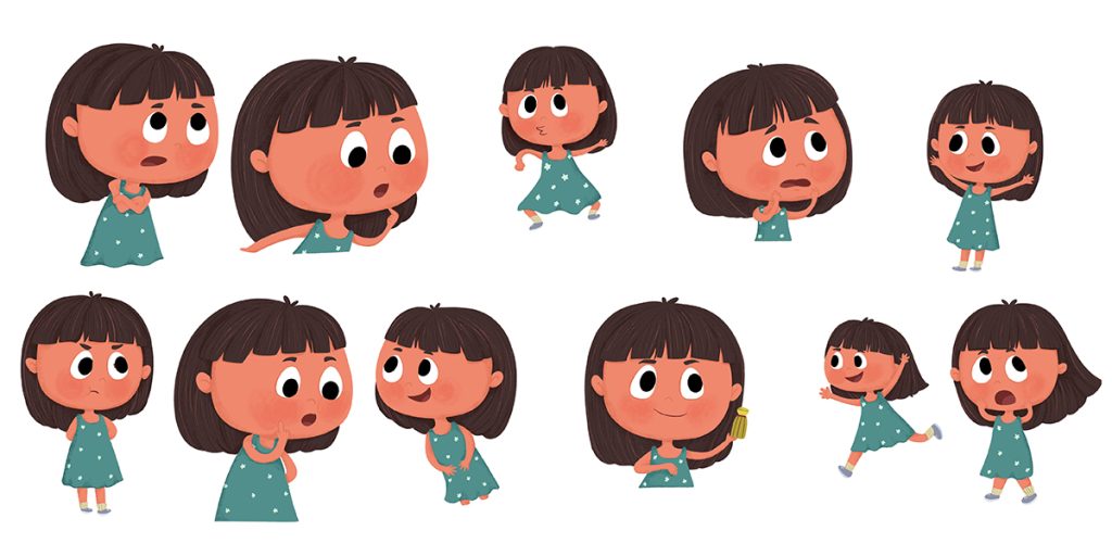
Partner with talented Book illustrators who specialize in creating lovable characters and enchanting scenes for picture books and early readers.
Mistake #7: Genre Mismatch
Fantasy covers need visual cues like mythical symbols, magical typography, or enchanted motifs. A modern sans-serif and grayscale palette signal a different genre—and disappoint fantasy fans. Keep your cover aligned with expected visual storytelling for fantasy books to connect instantly.
Mistake #8: Ignoring Feedback & Iteration
Skipping outside opinions can result in missed flaws. Host design iterations with beta readers or parent groups to see if your book cover design matches its intended child audience. Iterative reviews improve clarity, tone, and age appropriateness.
Mistake #9: Lack of Professional Polish
Amateurish covers like poor masking or inconsistent lighting—diminish credibility. For genres rich in visual storytelling, it’s worth hiring or consulting a designer experienced in fantasy book covers to ensure quality execution.
Mistake #10: Failing to Leverage Blank Space
Leaving no blank space makes a cover overwhelming and noisy. But strategic empty areas draw attention to central elements. Use whitespace to balance your color scheme and highlight focal symbols or characters.
How to Fix These Mistakes
- Simplify: Choose one symbol or image—like a glowing sword or playful dragon—that captures the story’s heart.
- Select genre-appropriate fonts: for children’s fantasy, choose playful yet clear serif, slab serif, or decorative styles.
- Design for thumbnails: test readability and impact at small sizes, both on mobile and in print.
- Use high-resolution imagery: avoid distortion that occurs when stretching or compressing visuals.
- Apply engaging color schemes: pick two to three cheerful yet thematic hues—bright greens, purples, or blues.
- Balance your layout: leverage the rule of thirds and whitespace to direct the eye.
- Iterate with real readers: get honest feedback from children, parents, and peers.
- Work with professionals when needed to polish visual storytelling and cohesion.
Real-World Example
Consider The Paper Bag Princess, a classic children’s fantasy: it features bold imagery, vibrant colors, clean typography, and plenty of whitespace—exemplifying strong Fantasy Book Cover Design for kids.
Conclusion
A thoughtful Fantasy Book Cover Design that avoids common book cover mistakes—like cluttered layout, poor typography, and mismatched color scheme can significantly impact young readers’ interest. School studies find that covers are often the first factor in children’s book selection.
By focusing on clear visual hierarchy, vibrant yet harmonious colors, and purposeful visual storytelling for fantasy books, you create a cover that both delights and engages. Testing readability in thumbnail form and iterating with real readers ensures your book cover design resonates. With polish and intentionality, your cover becomes a magical invitation to explore the story within. So if you are looking for a Book Cover design than we The Rainbow Stories is here for you and provide you the best fantasy book cover design services


