A well-designed Book Cover is the first magical touchpoint that draws a child into a story, making book cover design vital in children’s publishing. Studies show that both kids and parents rely heavily on cover visuals to select a book, with covers often outweighing summaries or back blurbs.
Striking coverings use clear typography in book cover design, balanced text placement on book covers, and harmonious color schemes to create a visually appealing layout that signals tone and genre at a glance. This guide explores how to blend illustration and text effectively to craft enchanting covers that grab attention.
Establish a Visual Hierarchy
A strong visual hierarchy on a Book Cover guides the eye naturally—first to the title, then the illustration, and finally the author name or subtitle. To achieve this, make the title prominent using size and contrast, and position it according to the rule of thirds—ideally near one of the grid’s intersection points—to create a balanced and visually appealing layout.
This intentional placement ensures young readers instantly grasp the book’s theme and feel drawn in. By structuring elements from most to least important, your book cover design becomes clearer, more engaging, and easier to understand at a glance.
Also Read:The 5 Core Elements of a Great Book Cover Design
Clear Focal Point for Children’s Covers
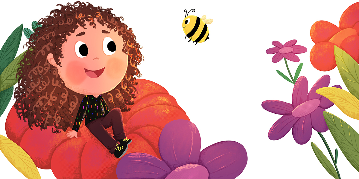
Children are naturally drawn to clear, engaging focal points. Whether it’s a friendly fox, a flying spaceship, or a cozy cottage, pick one central image and give it breathing room (turn0search0, turn0search2). Too many competing visuals cause confusion. A well-placed character or symbol makes the cover visually appealing and instantly memorable.
Typography: Legible and Expressive
Typography in book cover design plays a big role for kids’ readability. Choose playful yet readable fonts like soft serif or rounded sans serif—with clear letterforms (turn0search5). Ensure the title is bold enough for thumbnails, with secondary text smaller but still clear. Avoid overly fancy scripts that interfere with text placement on book covers and legibility.
Integrating Text and Image Seamlessly
Rather than placing text over busy artwork, integrate it thoughtfully. Consider wrapping titles around characters or placing text in clear sky areas. Use overlays or subtle backgrounds behind the text, ensuring letters stay crisp and book cover design feels unified (turn0search14). Give each element room to breathe—this harmony enhances engagement.
Color and Contrast
Color impacts emotion and legibility. Pick high-contrast pairings bright text against darker backgrounds or vice versa—and coordinate your color schemes with the mood. Primary colors work for early readers; softer pastels or magical hues fit fantasy themes (turn0search0, turn0search3). A confident color palette anchors both art and typography.
Bring Your Children’s Story Book to Life with Book Illustration
Partner with talented Book illustrators at The Rainbow Stories who specialize in creating lovable characters, great book cover and enchanting scenes for picture books and early readers.
Testing Across Formats & Sizes
Always preview your design across print and digital formats. A full-size cover can fall flat in thumbnail view if text is too small or blends into the artwork. Online platforms like Kindle previewer help you simulate thumbnail views. Adjust until art and text remain clear and visually appealing at every scale.
Common Pitfalls & Fixes
Mistakes happen—but they’re fixable:
- Text obscured by art: add contrast or move text to a blank area.
- Fonts that don’t match genre: playful fonts for whimsical stories, bold options for adventure.
- Color clashes: swap to complementary hues to enhance overall book cover design.
These fixes ensure your cover feels intentional, cohesive, and child-friendly.
Case Studies: Successful Examples
- A children’s picture book with a nighttime woodland scene uses glowing orange text wrapped gently around a fox, leaving clear sky space balanced and readable.
- Another cover shows a castle and hero silhouette, with bold, white typography set within the sky, providing a clean divide between text and illustration—classic hierarchy in action.
Such popular book covers demonstrate how engaging imagery and text can coexist without competing.
Checklist for Your Cover
Before finalizing, ask:
- Does the title stand out clearly?
- Is there a single, compelling focal point?
- Is typography aligned and legible at thumbnail size?
- Do colors harmonize and provide contrast?
- Is the overall layout balanced and visually appealing?
Adhering to this checklist ensures your cover performs beautifully for children and parents alike.
Conclusion:
A well-balanced Book Cover harmonizes illustration, Typography in book cover design, text placement on book covers, and cohesive color schemes to create a visually appealing first impression for young readers. Research shows children are naturally drawn to colorful, well-composed designs that reflect a story’s mood and content and that’s exactly what The Rainbow Stories delivers through its book cover design
By organizing design elements thoughtfully prioritizing a clear focal point, readable fonts, and high-contrast color pairings—you elevate your book cover design into a captivating visual narrative. When text and art support each other gracefully, your cover not only grabs attention but also conveys tone and genre, inviting exploration before the first word is read.


