When it comes to selling a book, your cover design is your silent salesperson — and its most persuasive tool is color. Long before readers open your book or read the blurb, they make an emotional judgment based on its color palette. Whether it’s a bright children’s story or a dark fantasy novel, colors communicate mood, genre, and emotion faster than words ever could.
Choosing the right colors isn’t just an artistic decision it’s a marketing strategy. If you want your story to stand out on crowded shelves or digital marketplaces, understanding how book cover color psychology influences buying decisions can help your book reach more readers and sell more copies.
Why Color Matters in Book Marketing
In visual storytelling, color is emotion. It defines tone, influences perception, and triggers feelings before readers even process your title. In fact, marketing studies suggest that up to 85% of buying decisions are influenced by color.
When browsing through hundreds of titles online or in bookstores, readers gravitate toward colors that feel right for their mood or favorite genre. That’s why the best-selling authors and publishers use book cover color psychology to strategically evoke emotion and expectation.
A successful color scheme not only captures attention but also builds instant trust signaling that your story belongs to a specific category and delivers what the reader is looking for.
Understanding Color Psychology in Book Covers
Each color carries an emotional and psychological meaning. In book cover design, understanding these associations helps you align your story’s message with your visual identity.
Here’s a quick breakdown:
- Red: Passion, energy, danger perfect for thrillers or romance.
- Blue: Calm, wisdom, or mystery common in children’s bedtime stories or self-help books.
- Yellow: Optimism and creativity ideal for lighthearted, humorous, or motivational titles.
- Green: Growth, nature, balance often used in environmental or educational books.
- Purple: Magic, imagination, royalty great for fantasy or inspirational stories.
- Black: Sophistication and power used in luxury design or serious nonfiction.
- White: Simplicity and purity fits minimalist, modern, or children’s picture books.
When applied correctly, colors act as visual cues that tell readers what kind of experience they can expect from your story.
Matching Color to Genre
Your cover colors should instantly communicate your book’s genre. If a child picks up a book, they expect playful hues. If an adult reaches for a thriller, they anticipate darker, bolder tones.
Here’s how to align your color palette for book design with your genre:
- Children’s Books: Bright, cheerful colors like red, yellow, turquoise, and pink create joy and excitement.
- Fantasy: Deep purples, emerald greens, and midnight blues evoke mystery and wonder.
- Romance: Warm shades such as blush pinks, reds, and golds build emotional warmth.
- Mystery/Thriller: Contrasts like black and red or dark blue with white suggest suspense and tension.
- Nonfiction: Blues, whites, and grays establish professionalism and trust.
By aligning your palette with your genre, you make it easier for readers to recognize that your story fits what they’re looking for — increasing both click-throughs and conversions.
How Colors Influence Buying Decisions
Colors don’t just reflect emotions — they trigger them. In marketing, this is called emotional design. Readers associate specific feelings with certain colors, influencing whether they’ll stop, click, or buy.
For instance, warm colors (reds, oranges, yellows) create excitement and urgency, encouraging faster decisions — great for adventure or motivational books. Cool colors (blues, greens, purples) build trust and calm, ideal for thoughtful or educational stories.
Combining the two can create balance — for example, a children’s book might use cool background tones with warm character accents to draw attention while maintaining harmony.
This balance between excitement and trust often determines how “buyable” your cover looks.
Choosing Colors That Match Your Audience
The target audience plays a crucial role in color selection. Children respond to bold, contrasting hues, while adults prefer refined palettes that align with tone and sophistication.
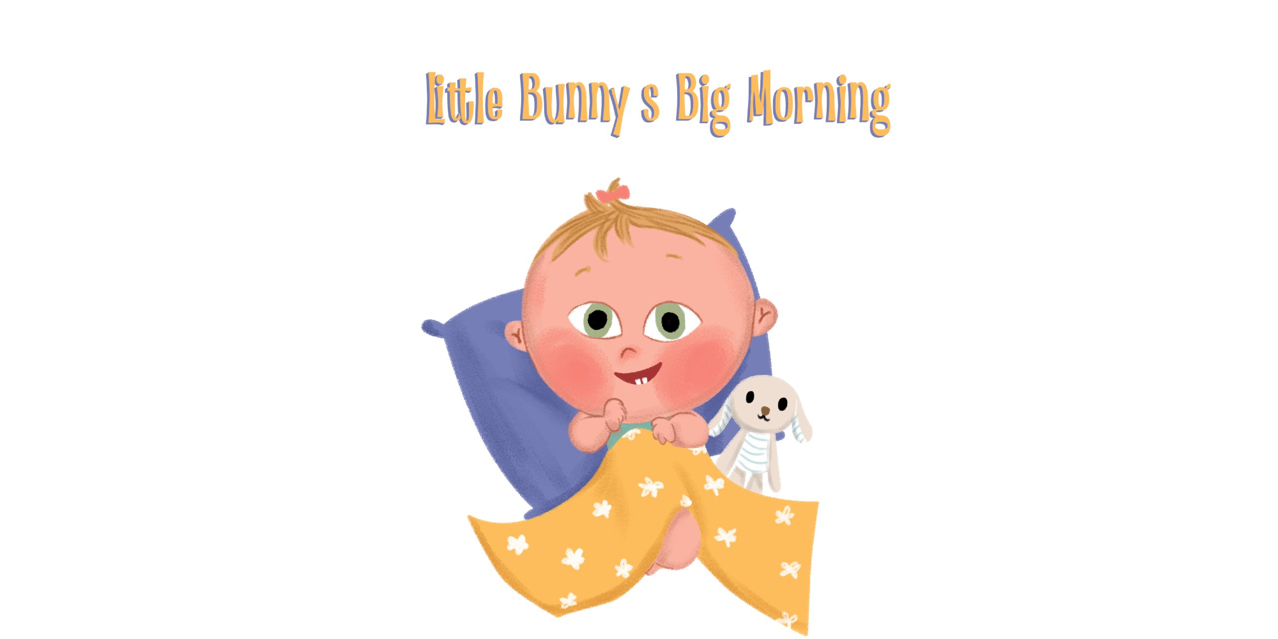
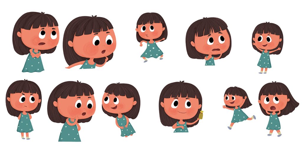
For children’s book authors, playful color combinations work best: bright reds, yellows, and blues combined with expressive illustrations. These colors spark curiosity and encourage emotional connection.
For YA or middle-grade audiences, slightly muted or pastel tones can balance maturity with imagination.
And for adult genres, subtle gradients, monochromatic schemes, or accent contrasts project professionalism and trustworthiness.
Always test your cover with your target audience — what appeals to a 5-year-old might repel a 35-year-old, and vice versa.
The Role of Contrast and Readability
Even the most beautiful colors fail if your text isn’t readable. High contrast between background and typography ensures your title and author name stand out especially on small digital thumbnails.
- Use dark text on light backgrounds or light text on dark designs for maximum visibility.
- Keep color combinations consistent throughout your branding — on your website, marketing posts, and author logo.
Consistency builds recognition, helping your audience identify your books at a glance.
Current Trends in Book Cover Color Design
Modern publishing aesthetics are leaning toward bold contrasts, gradient overlays, and minimalist palettes. Some of 2025’s top trends include:
- Pastel minimalism – soft hues with clean fonts for emotional children’s books.
- Vibrant duotones – two-color contrasts that pop in digital stores.
- Gradient magic – smooth transitions of color that feel modern and dynamic.
- Metallic accents – golds, silvers, or foil textures that add luxury and attention-grabbing sparkle.
Adapting these styles helps your cover feel current while maintaining emotional resonance.
Work with a Professional Designer
Even if you understand color theory in publishing, translating it into a visually powerful cover requires expertise. A professional book cover designer knows how to blend emotional color psychology, typography, and layout into one cohesive visual story.
They’ll also ensure your design looks just as stunning in print as it does on digital platforms — where color calibration and lighting vary significantly.
At The Rainbow Stories, our design team specializes in custom book cover design and illustration that blend art and strategy turning color into conversion.
Conclusion
In the publishing world, color isn’t decoration it’s communication. The right color palette can attract readers, evoke emotion, and build trust before a single page is read. By understanding book cover color psychology and aligning it with your genre and audience, you transform your design from simply beautiful to commercially powerful.
At The Rainbow Stories, we help authors bring their visions to life through colorful storytelling and professional cover design that sells.


