Children Book Illustration is about more than charming drawings it’s a powerful narrative tool. This article explores how to choose colors for a children’s book, explains why bright colors work so well in kids’ illustrations, and reveals how color can enhance storytelling. You’ll also find practical illustrator tips for using color effectively to craft emotionally engaging, visually cohesive picture books.
What is Children Book Illustration?
Children Book Illustration uses color deliberately to shape tone, focus, and emotional engagement. The use of color in storytelling is critical for young readers’ comprehension and emotional journey.
The Emotional Impact of Colors
Warm hues like red, orange, and yellow can create joy, playfulness, or energy, while cool tones such as blue, green, and purple foster calm, contemplation, or mystery. The emotional impact of colors supports mood arcs and plot clarity. Studies confirm children respond more strongly to saturated, warm colors in upbeat scenes and cooler tones during calmer moments.
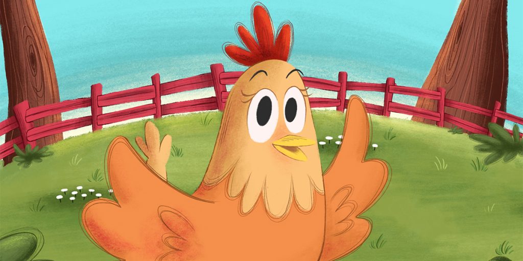
Why Bright Colors Work in Kids’ Illustrations
Bright, vibrant colors are vital in colorful images for young readers. Research shows that vivid tones help young eyes detect and remember visuals better, boosting attention and memory retention. This explains why bright colors work in kids’ illustrations so effectively.
Using Color to Enhance Storytelling for Children
Purposeful using color to enhance storytelling for children is about more than aesthetics—it uses palette shifts to signal narrative turns. For example, a transition from warm sunrise tones to cool twilight visuals marks climactic shifts. A study of picture book color transitions confirmed that palette changes highlight plot development. Similarly, recurring visual cues—like a red balloon during happy peaks or cooling shadows in quiet scenes—reinforce story beats and emotional pacing.
Want to learn how color choices shape a story’s emotion and pacing? Explore our in-depth guide on Children Book Illustration for expert tips on visual storytelling, styles, and illustration techniques.
Color Schemes in Picture Books
A consistent color palette across spreads creates cohesion and helps guide pacing and mood. Effective color schemes in picture books often include a base of neutral or muted tones accented with bold hues to ensure readability and focus. This combination aids accessibility and prevents visual overload.
Warm and Cool Colors in Illustrations
The strategic use of warm and cool colors in illustrations enables natural mood shifts. Warm tones bring characters forward; cool shades recede backgrounds, establishing visual hierarchy and emotional flow. Studies also confirm that warm hues stimulate excitement, while cool shades calm and soothe.
How to Choose Colors for a Children’s Book
- Match scene descriptors to hues, such as “joyful” with blues and greens or “energetic” with reds and oranges.
- Build a limited palette (5–7 base hues plus accents) to keep visual flow tight and meaningful.
- Thumbnail-test across spreads: early sketches help avoid sudden color jumps that can disturb narrative coherence.
- Document palette: keep hex codes or swatches for consistency—crucial in series or collaborations.
Illustrator Tips for Effective Color Use
- Emotion keyword to palette: write down a scene’s mood, then pick matching colors.
- Use bright accents sparingly to focus attention without overstimulating.
- Ensure visual hierarchy: reserve warm, saturated highlights for important characters or actions.
- Check for contrast and accessibility: colors must be clearly legible and inclusive. Bright palettes must balance readability.
- Adapt to cultural symbolism: purple may signify magic in one culture, while green could symbolize growth or envy—choose palettes mindfully.
The Cognitive & Emotional Benefits
Illustrations serve as visual cues that support comprehension and vocabulary acquisition. When children engage with colorful illustrations for young readers, they remember story details more effectively thanks to high-saturation visuals enhancing memory performance.
Balancing Bright Colors and Minimalism
Even simplified pages benefit from strategic bright accents. In minimal layouts, a bold red balloon on a neutral background draws focus, conveying narrative beats without clutter. This proves why bright colors work in kids’ illustrations, even in sparse designs.
Cultural Representation Through Color
Inclusive Children Book Illustration considers diverse cultures in palette choices. The Snowy Day by Ezra Jack Keats used color and setting to foreground an African American protagonist, influencing representation norms in picture books. Thoughtful palettes help modern authors reflect cultural authenticity and inclusion.
Conclusion
Children Book Illustration thrives when color becomes a storytelling partner. By understanding how to choose colors for a children’s book, why bright colors work in kids’ illustrations, using color to enhance storytelling for children, and applying illustrator tips for effective color use, creators elevate their narrative. With well-planned color schemes in picture books, balanced color palettes, and thoughtful warm and cool colors in illustrations, picture books transform from decorative to deeply engaging. At The Rainbow Stories, we believe colorful illustrations help young readers connect through mood, memory, and emotion.