Self-publishing has opened the doors for countless authors to bring their stories to life without waiting for traditional publishers. But while writing a book is an art in itself, designing a professional book cover is a completely different challenge.
Your cover is the first thing potential readers see and often the deciding factor between clicking buy or scrolling past. No matter how well your story is written, if the cover looks amateurish, readers may never give it a chance.
Here are practical, proven tips to help self-published authors create book covers that look polished, credible, and ready to compete on any bookshelf digital or physical.
Understand the Power of First Impressions
A professional book cover design communicates trust and quality instantly. Readers associate good design with good storytelling. That’s why investing time (or budget) into your cover isn’t just about aesthetics — it’s about marketing your story effectively.
Remember: your cover doesn’t have to please everyone, but it must instantly appeal to your target audience. A romance reader expects warmth and emotion; a thriller fan looks for tension and mystery. Aligning design with genre is the first step toward professionalism.
Study Genre Trends Before You Design
Every genre has design conventions that help readers instantly recognize what type of story they’re buying. Before you begin designing, study the top 20 bestsellers in your category on Amazon or Goodreads.
Notice the patterns:
- Romance: Soft color palettes, elegant typography, illustrated or photographic couples.
- Thrillers: Dark tones, high contrast, bold sans-serif fonts, and minimal imagery.
- Fantasy: Detailed illustrations, symbolic emblems, and rich, textured backgrounds.
- Non-fiction: Clean layouts, professional fonts, and strong hierarchy between title and subtitle.
Your goal is to look like you belong on the same shelf as other professional titles while still maintaining a unique flair.
Also Read:Behind the Scenes: The Process of Designing a Book Cover
Choose the Right Font Combinations
Typography is one of the biggest giveaways of an amateur cover. Choosing the wrong font or too many can ruin even the best artwork.
Here’s how professionals handle it:
- Use no more than two fonts (one for the title, one for the author name).
- Choose fonts that match your genre modern sans-serifs for thrillers, elegant scripts for romance, or serif fonts for literary fiction.
- Ensure the text is readable at thumbnail size (especially important for Kindle and ebook stores).
- Avoid overused or decorative fonts that make your book look unprofessional.
- Good typography doesn’t shout it speaks clearly and confidently.
Focus on Color Psychology
Colors have the power to trigger emotion. Professional designers use color psychology to communicate a book’s tone even before the reader reads the title.
Here’s what different colors typically convey:
- Blue – Trust, intelligence, calmness (ideal for non-fiction or memoirs)
- Red – Passion, urgency, danger (great for thrillers or romance)
- Yellow/Orange – Energy, warmth, creativity (perfect for children’s or inspirational books)
- Black/Gray – Mystery, seriousness, sophistication (fits thrillers or dystopian stories)
Pick a color palette that supports your story’s mood and message. Keep it balanced and avoid overly bright or clashing tones unless intentional for the genre.
Use High-Quality Imagery or Illustrations
Low-resolution or generic stock images are the easiest way to make your book look amateur. A professional-looking cover always uses high-quality visuals whether that’s a custom illustration, licensed photography, or digital artwork.
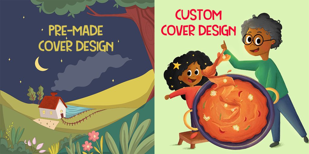
If possible, work with a professional illustrator or designer who can tailor visuals to your story’s themes. For example, a children’s fantasy tale might benefit from whimsical hand-drawn art, while a self-help book could use sleek, minimal photography.
Even if you’re designing it yourself, always ensure:
- Images are high-resolution (300 DPI)
- You have the right to use them commercially
- They align perfectly with the tone of your story
Maintain Balance and Hierarchy
A polished book cover follows the basic rules of visual hierarchy — a clear structure that guides the viewer’s eyes. Typically, the title is the focal point, followed by the subtitle, then the author name.
Keep spacing consistent, align text carefully, and avoid clutter. If you’re unsure, look at how major publishing houses lay out their covers — clean, centered, and balanced.
White space is not your enemy; it’s what makes your design breathe.
Also Read:How to Choose Colors That Sell Your Book
Get Professional Feedback Before Publishing
Even the best designers need a second opinion. Before you finalize your cover, share it with beta readers, fellow authors, or a design professional.
Ask for specific feedback:
- Does it look like it belongs in the genre?
- Is the title easy to read?
- Would you pick it up in a bookstore?
A few objective opinions can save you from publishing a cover that turns readers away.
Consider Hiring a Professional Designer
If design isn’t your strength, hiring a book cover designer can be a smart investment. A skilled designer understands visual storytelling, typography, and market psychology things that go far beyond simple software tools.
Professional designers not only create stunning visuals but also ensure your cover meets technical printing standards, whether for Amazon KDP, IngramSpark, or physical bookstores.
Your book deserves the same level of quality as traditionally published titles — because readers can tell the difference.
Conclusion
Creating a professional self-published book cover takes more than creativity — it requires strategy, understanding, and attention to detail. From researching your genre to refining typography and color, each element tells part of your story before the first word is read.
If you want your book to stand proudly among bestsellers, don’t settle for average. Invest time, skill, or expert help to make your cover reflect the quality of your writing.
At The Rainbow Stories, our custom book cover design services help self-published authors turn their stories into visually stunning books that readers can’t resist. Because every great story deserves a great first impression.


