
Typography on custom book covers is more than just decorative—it’s a powerful storytelling tool that sets tone, signals genre, and guides the reader’s eye. The right font instantly communicates your book’s mood—whether it’s suspense, romance, or knowledge—while reinforcing your author brand.
Thoughtful book cover typography establishes visual hierarchy, ensuring your title, author name, and subtitle stand out clearly in thumbnails and print alike. By mastering spacing, contrast, and font pairing, you transform your cover into a compelling visual invitation. In this post, we’ll explore how to leverage font choices and structure to create arresting, genre-aligned custom book covers.
1. Match Typeface to Genre
Selecting the right font is the first step when designing custom book covers.
- Literary fiction often benefits from serif typefaces like Bembo or Perpetua, which convey tradition and sophistication.
- Nonfiction and contemporary books work well with clean sans-serif fonts such as Frutiger, Helvetica, or Montserrat to evoke clarity and modernity.
- For fantasy or sci-fi, choose decorative or futuristic fonts that hint at genre and tone. For more insights into genre-specific design, explore our guide to Custom Book Cover Design.
2. Limit Font Choices
Stick to a maximum of two typefaces in your design—one bold font for the title and a simpler one for supporting text. This disciplined choice strengthens visual hierarchy and ensures unity, avoiding clutter and confusion. Limiting font variety creates a cohesive, professional look that’s pleasing to the eye.
3. Prioritize Legibility and Hierarchy
Your personalized book covers need readable type both up close and in thumbnail form. Utilize font size, weight, and spacing to establish clear hierarchy—title, author, and subtitle—so the eye naturally follows the order of importance. Adjust kerning and leading to create breathable, polished typography, essential to design elements and readability.
4. Pair Fonts Thoughtfully
Effective font pairing involves combining a striking display font with a clean body font.For example: a decorative serif for the title with a neutral sans-serif like Frutiger for the author name.This contrast brings depth and clarity to your book cover typography.
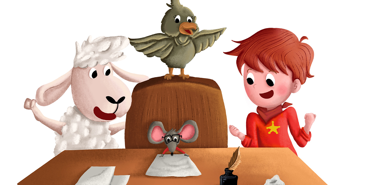
Bring Your Children’s Story to Life with Magical Custom Book Cover Design
Partner with Book illustrators who understand your vision and create book covers that spark curiosity and wonder.
5. Integrate Typography and Imagery
Good custom book covers integrate text and visuals seamlessly. Overlaying typography on images requires sufficient contrast and space.
Align your text with visual elements to guide the eye and maintain harmony—key design elements of impactful covers.
6. Apply Color, Contrast & Spacing
Choose colors that enhance contrast between text and background.High contrast ensures readability—light type on dark backgrounds, or vice versa. Consider color psychology to reinforce genre: red for thrillers, blue for nonfiction, pastels for romance. Maintain consistency in spacing—kerning, tracking, and leading—for a clean, professional look .
7. Emphasize Visual Hierarchy
Use size, weight, color, and contrast to direct readers’ attention.Ensure your title is most prominent, with supporting text clearly distinguishable but secondary.This structure aligns with guidelines for visual hierarchy and prevents clutter.
Discover how this works in practice with our Custom Book Cover Design Services
8. Avoid Common Pitfalls
- Stay away from overused or whimsical fonts like Comic Sans or Papyrus.
- Don’t use decorative scripts that hurt readability.
- Limit font styles to no more than two per design.
- Always respect font licensing for commercial book use.
9. Test Across Formats
Preview your design at real-world sizes:
- Thumbnail views for online platforms,
- Full-size print mockups,
- Marketing banners.
Typography must remain legible and impactful across all formats especially important when considering how to make custom book covers that truly shine.
10. Refine Through Feedback
Gather input via A/B testing, peer reviews, or reader surveys. Multiple mockups reveal which custom book covers connect best visually and emotionally. Iterative feedback allows you to fine-tune font choices, spacing, and hierarchy—matching professional book cover design services processes .
11. Leverage Professional Design Services
While DIY covers are tempting, experienced designers excel at selecting fonts, aligning typography with imagery, and ensuring proper hierarchy. Services offering personalized book covers bring advanced design elements and polish. They often know the best fonts for book covers—from classics like Times New Roman or Perpetua, to modern picks like Montserrat or Orbitron—tailored to various book genres.
To explore working with a creative team that understands genre, tone, and audience then, The Rainbow Stories is here for you.
12. Font Recommendations by Genre
- Nonfiction: Frutiger, Helvetica, Goudy Bookletter, Futura.
- Romance: Script fonts like Bentham or Twilight add elegance.
- Mystery/Thriller: Bold condensed fonts like Dharma Gothic or League Gothic add intensity.
- Sci-Fi & Fantasy: Futuristic or medieval-style fonts reflect genre expectations
Conclusion
Mastering book cover typography is a key step in creating effective custom book covers.By choosing genre-aligned fonts, limiting typefaces, integrating text with visuals, ensuring contrast, and applying strong hierarchy, your cover will stand out.
Whether you design yourself or hire book cover design services, font choices significantly shape first impressions and reader engagement.
Want real-world examples, font pairings, or help A/B testing your covers? Let’s elevate your typography for standout results.


