
Choosing the right fantasy book cover colors is about more than visual appeal—it shapes emotion and draws young readers into magical worlds. Studies show vivid hues like yellow, blue, and green boost attention and memory in children’s literature, while darker tones convey mystery and adventure. By leveraging psychology in book cover color, authors can design children’s book covers that communicate joy, curiosity, or wonder before a single word is read. In this guide, you’ll learn how to craft a cohesive color scheme, apply a compelling color palette, and enhance your book cover design to resonate with your audience’s imagination.
Why Color Psychology Matters
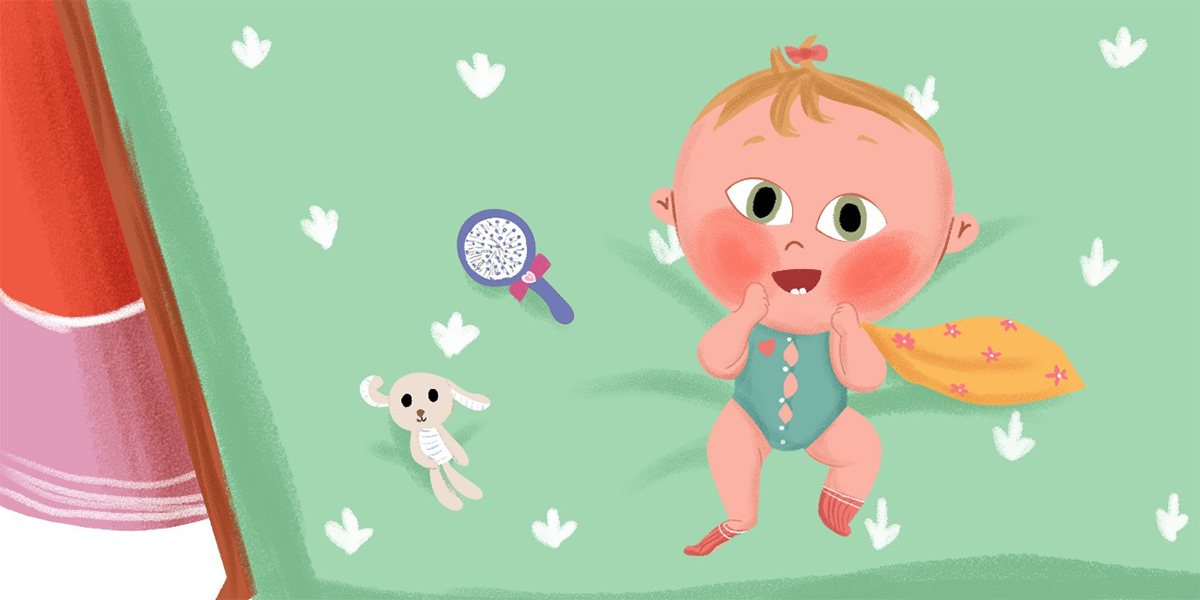
Understanding color psychology in book cover design is key—colors whisper mood and message before words are read. Spines notes that color combinations influence emotional response and buyer behavior. For children, vivid and cheerful fantasy book cover colors like yellow, red, and light blue feel welcoming and immersive. With color scheme selection, you guide their first impression and create a sense of storyline promise.
Decoding Common Colors in Children’s Fantasy
Each color carries meaning:
- Yellow exudes happiness and creativity, ideal for uplifting magical adventures.
- Blue instills calm and exploration—perfect for fantasy realms and mysterious skies.
- Green speaks of nature, growth, and harmony—great for enchanted forests.
- Purple suggests mystery, spirituality, or whimsical kingdoms.
- Red/orange add excitement and energy—suited to action-packed quests.
Combining two or three hues creates visual cohesion, essential in color in book cover design.
Bright vs. Muted Keywords
For children’s books, bright and saturated colors are preferred—they’re playful and catch the eye. Muted tones may feel too distant or somber for younger readers. Aim for cheerful color scheme choices that align with your story’s mood and target age.
Symbolic Color Pairing
Mixing colors can amplify message:
- Purple + gold signals royal magic.
- Green + silver evokes moonlit forests and mystery.
- Blue + yellow feels watery wonder and sunny optimism.
These color palette pairings enhance book cover design, reinforcing story tone and reader expectations.
Typography & Color Harmony
Consider how your title color plays with artwork. Light titles on dark backgrounds improve readability; dark text on pastel scenes feels warm. Ensure font stands out in thumbnails and matches the cover’s color scheme. Good typography complements colors and preserves clarity.
Integrating Color into Illustrations
Extend your chosen fantasy book cover colors into all design elements: character accents, magical effects, borders. Carry the palette onto the spine and back cover to maintain unity. This visual cohesion makes your book covers more professional and memorable.
Testing Across Formats
Always proof your cover in CMYK at 300 dpi to ensure printed colors match digital vision. Check thumbnails on different devices—colors can appear dull or distorted. Testing ensures your palette retains vibrancy and stands out both in physical and virtual worlds.
Tailoring Colors to Story Subgenres
Choose palettes based on your story type:
- Whimsical children’s fantasy: bright yellows, sky blues, soft pinks.
- Magical adventure: forest greens, golds, light purples.
- Mystery fantasy: midnight blues, silver, pale yellow accents.
Keeping your color scheme consistent with the story’s mood enhances immersive reading appeal.
Bring Your Children’s Story to Life with Fantasy Book Cover Design
Partner with talented Book illustrators who specialize in creating lovable characters, fantasy book cover and enchanting scenes for picture books and early readers.
Real‑World Examples
- Red Sings from Treetops uses a vibrant array of seasonal colors to reflect nature’s wonder.
- The Color Kittens creatively explores mixing primary colors, teaching kids color blending visually.
- The Neverending Story alternates red and green type to symbolize dual worlds, subtly hinting at chapter shifts.
Practical Steps for Authors
- Define your story’s emotional tone and target age.
- Choose your dominant fantasy book cover colors based on psychological cues.
- Add one or two accent colors to enhance depth and contrast.
- Apply colors consistently across the front, spine, and back.
- Mock up in thumbnail, print view, and device screens.
- Get feedback—children and parents can tell if colors feel right.
Common Mistakes to Avoid
- Using too many colors at once—keeps the eye wandering.
- Picking palettes that clash with story tone—e.g., dark themes with neon pastels.
- Skipping print tests—RGB to CMYK shifts can unintentionally dull your palette.
When to Hire a Color‑Savvy Pro
If you’re unsure how to balance color tone and narrative, working with a designer experienced in psychology in book cover choices can elevate your cover’s emotional impact.At The Rainbow Stories we can help you blend color theory, book cover design, and fantasy storytelling into a cohesive visual statement.
Conclusion
Color psychology in children’s fantasy book cover design isn’t just decorative—it’s the emotional lens that guides young readers into your story. By thoughtfully selecting fantasy book cover colors—bright yellows to evoke happiness, deep blues for calm or mystery, lively greens for growth—you create a color scheme that resonates with mood and narrative.
Strategic color palette choices enhance comprehension and child engagement, as studies show color boosts retention and visual interest in children’s literature. Test your palette across digital thumbnails and CMYK proof prints, then refine to balance vibrancy with purpose. When executed well, color becomes your silent storyteller—enticing young imaginations before they even read the first line.


