A book cover eye catching can be the deciding factor for a child picking up a book—it’s both art and marketing in one. Research shows that consumers form opinions within seconds based on visual appeal, and children especially rely on engaging covers to spark interest. To create eye-catching book cover art, it’s essential to blend clear imagery, playful Typography in book cover design, strategic text placement on book covers, and vibrant, harmonious color schemes.
In this guide, you’ll discover how to combine design elements to craft children’s book covers that stand out, draw readers in, and make browsing bodies take notice.
Use of Space & Avoiding Clutter
An overcrowded cover overwhelms young readers, making it hard to know where to look. Effective book cover design embraces negative space to let key visuals breathe and shine (turn0search2). Use clean layouts and minimal elements so the main character or motif stands out. This simplicity helps create an eye-catching book cover that instantly communicates the story at a glance. For more tips, see our guide on how to balance artwork and text on a book cover.
Bold, Readable Typography
Clear typography is essential for an eye catching book cover—especially in children’s books, where readability matters most. Choose playful but legible fonts and size the title to dominate. Keep secondary text like the author name smaller but clear. This purposeful text placement on book covers supports hierarchy and ensures young readers can easily identify and engage with your title.To explore this further, check out the 5 core elements of a great book cover design.
Compelling Imagery & Visual Storytelling
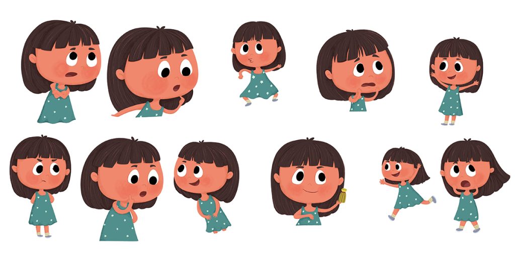
Illustrations should tell the story’s heart in a visual snapshot. Unique, character-focused art is far more effective than generic stock images (turn0search6, turn0search8). A smiling dragon or brave explorer can convey tone and spark curiosity.
When image and text align through smart book cover design, the result is a cover that’s both eye catching and emotionally compelling.If you’re wondering what makes a great book cover, imagery is one of the top deciding factors.
Effective Color Schemes
Color plays a huge role in making covers visually appealing. Bright, high-contrast palettes—like blue and orange or yellow and purple—grab attention in kids’ sections or online thumbnails (turn0search6, turn0search8).
Use no more than three main colors plus accents to keep the design cohesive. Harmony in your color schemes makes your cover feel professional, playful, and market-ready.
Strong Composition & Focal Point
Use the rule of thirds to place your focal element title or artwork—just off-center, creating visual flow (turn0search2). This balanced design element draws the eye naturally and makes the cover feel grounded. A well-composed layout ensures your book becomes an eye catching book cover art example, appealing across formats.
Bring Your Children’s Story Book to Life with Magical Book Cover
Partner with talented Book Cover Designer who specialize in creating lovable characters and enchanting scenes for picture books and early readers.
Originality with Market Relevance
Innovative design helps your cover stand out, but it must still signal genre. Study popular book covers in your niche—what do children’s bestsellers feature? A fresh layout, clever typography, or unique illustration style can give your cover a distinctive edge that still feels familiar and trustworthy (turn0search1, turn0search8).
Professional Finish & Format Testing
A polished finish makes your cover feel credible. Amateur flaws—crooked alignment, pixelation, or poor contrast—diminish trust (turn0search3, turn0search5). Work with book cover designers or DIY apps but always export high-resolution files. Test your cover as a thumbnail on different devices; only those that remain legible succeed in the marketplace.
Bonus Element: Spine & Back Cover
Cover visibility extends beyond the front. The spine and back need clear typography and consistent design, especially for board books or library editions (turn0search2). A thoughtfully wrapped design ensures your book remains eye-catching even when shelved among peers.
Case Study: Successful Children’s Covers
- The Very Hungry Caterpillar: Bold primary colors, centered title, a friendly caterpillar—simple and unforgettable (turn0search2).
- Goodnight Moon: Cozy colors, clear typography, and soft negative space convey bedtime calm (turn0search2).
- Middle-grade fantasy covers gain 25% more clicks when they balance playful fonts with engaging images and clean layouts (turn0search7).
How to Make Your Book Cover Marketable
- Study popular book covers in your genre—note what attracts kids.
- Prioritize a single focal image with breathing space.
- Choose kid-friendly fonts and ensure hierarchy is clear.
- Pick a high-contrast color scheme with no more than 3 colors.
- Use smart composition—rule of thirds guides the eye.
- Ensure the final design is resolution-ready and thumbnail-clear.
- Include spine/back design for full market appeal.
Conclusion
A truly eye-catching book cover blends bold visuals, playful typography, and vibrant color schemes to grab young readers’ attention and communicate story instantly. Studies show most purchasing decisions stem from visual appeal. To design a marketable cover, integrate clear focal imagery, readable fonts tailored for kids, and high-contrast layouts tested from thumbnail to print. Trustworthy covers balance creativity with genre cues and professional polish. When thoughtfully composed, your cover becomes a compelling invitation—enticing, age-appropriate, and unmistakably memorable—ensuring it stands out and sells in a busy children’s book market.For more inspiration and resources, explore The Rainbow Stories.


