Color plays a central role in shaping how children engage with books. Beyond illustrations and characters, color styles define the emotional atmosphere of a story, guide attention across pages, and influence how young readers remember the visuals long after the book is closed. In modern children’s publishing, color is not chosen randomly—it follows carefully planned styles that enhance storytelling, learning, and brand recognition.
Today’s children’s books blend artistic creativity with psychological insight and digital design trends. While earlier picture books relied primarily on basic primary colors, contemporary titles showcase a rich variety of palettes, ranging from soft minimalist pastels to bold graphic contrasts and textured watercolor blends. These evolving styles reflect changes in printing technology, audience expectations, ergonomic design research, and even social preferences for inclusive representation and sustainability.
Understanding popular color styles in modern children’s books helps authors, illustrators, designers, and publishers make smart artistic choices that elevate their storytelling. A well-selected color style makes characters stand out clearly, helps readers follow the narrative flow, and ensures each spread feels visually connected. When colors match the story genre and the age group of the target audience, illustrations become more accessible and more emotionally impactful.
In this guide, we explore the most popular modern color styles shaping children’s books today. You’ll learn where each style works best, how it affects young readers emotionally, and how professional illustrators use these palettes to achieve consistency and visual appeal. Whether you’re planning a playful toddler picture book or a dreamy fantasy story, this overview will help you choose a color style that matches your creative vision and resonates with your readers.
Why Color Styles Matter in Children’s Books
Color styles function as the visual language of storytelling:
Emotional Direction
Colors guide young readers’ moods—bright colors inspire energy, soft hues promote calmness, and vibrant contrasts evoke excitement.
Learning Support
High-contrast visuals enhance object recognition, especially for preschoolers and early readers.
Branding & Recognition
Consistent color styles contribute to author or series branding, making books instantly recognizable on bookstore shelves or online platforms.
Visual Flow
Cohesive palettes prevent visual clutter and guide the reader smoothly from page to page.
Also Read:Color Themes That Make Children’s Books Stand Out
Age-Based Color Preferences
Color styles should adjust based on child development:
| Age Group | Best Style Features |
|---|---|
| Ages 1–3 | Primary colors, bold shapes |
| Ages 4–7 | Vibrant blends with variety |
| Ages 8–12 | Subtle hues and textured palettes |
Most Popular Color Styles in Modern Children’s Books
Soft Watercolor + Digital Hybrid
This style combines the warmth of watercolor washes with crisp digital detailing.
Features:
- Textured backgrounds
- Gentle color gradients
- Hand-painted feeling with polish
Best For:
- Storybooks with emotional warmth
- Bedtime narratives
- Character-driven tales
Impact:
Watercolors communicate authenticity and calm emotion while keeping visuals light and airy.
Bold Graphic & Minimalist Style
Minimalistic shapes paired with intense flat colors dominate early learning books.
Features:
- High contrast palettes
- Simple shapes
- Thick outlines
Best For:
- Board books
- Alphabet or number learning
- Very young readers
Impact:
Simple visuals reduce cognitive overload and improve comprehension.
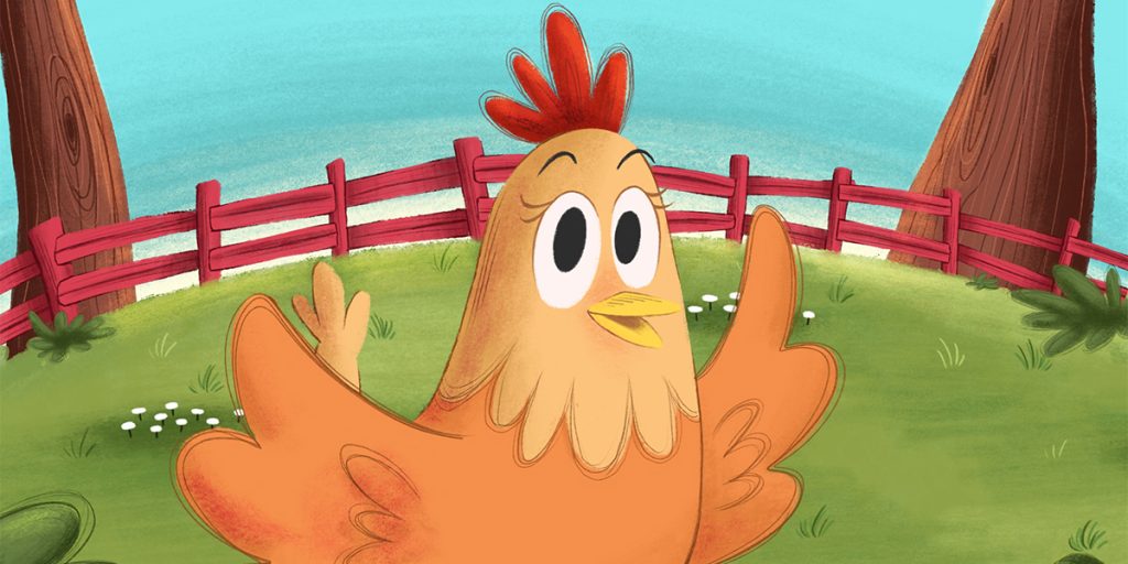
Bright Saturated Colors
This energetic style uses punchy reds, dazzling yellows, neon greens, and electric blues.
Features:
- Eye-catching contrasts
- Limited shading
- High color vibrancy
Best For:
- Humor-focused stories
- Action scenes
- Preschool adventures
Impact:
Instant attention capture and emotional excitement.
Muted Earth Tone Style
Modern prints are embracing earthy shades like sage green, terracotta, soft brown, and dusty blue.
Features:
- Natural realism
- Soft saturation
- Cozy visuals
Best For:
- Animal stories
- Environmental narratives
- Cultural education books
Impact:
Feels grounded and calming while enhancing scenic storytelling.
Fantasy Jewel Tone Style
Rich, glowing colors inspired by gemstones dominate modern fairy tales.
Features:
- Deep purples
- Emerald greens
- Golden highlights
Best For:
- Mythical worlds
- Magical adventures
- Hero journeys
Impact:
Creates visual magic and a sense of awe.
Pastel Storybook Style
Pastel palettes create dreamy environments using baby blues, blush pinks, and creamy yellows.
Features:
- Soft mood control
- Low eye strain
- Dreamlike backgrounds
Best For:
- Bedtime stories
- Gentle moral tales
- Nursery favorites
Impact:
Calms children and enhances bedtime routines.
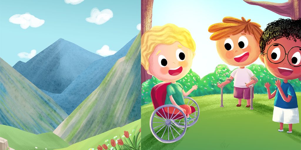
Inclusive Neutral Style
Diverse modern titles adopt neutral tones paired with inclusive character shades.
Features:
- Balanced spectrum of skin tones
- Subdued background layers
- Gentle contrast
Best For:
- Social/emotional learning books
- Representation stories
- Empathy narratives
Impact:
Promotes emotional identification and cultural inclusivity.
Monochrome with Accent Pop
This style limits the palette to grayscale or sepia tones plus one vibrant accent color.
Features:
- Cinematic illustration
- Strong visual hierarchy
- Dramatic storytelling
Best For:
- Emotional stories
- Educational timelines
- Artistic projects
Impact:
Guides visual attention and adds narrative emphasis.
Digital Vector Flat Design
High-tech digital artwork uses smooth lines and digital textures.
Features:
- Bright but controlled color blocking
- Animation-style visuals
- Sharp shapes
Best For:
- STEM learning books
- Tech-based stories
- Action narratives
Impact:
Conveys modern appeal and clarity.
Also Read:Book Cover Design for a School Project
How Professional Illustrators Choose Color Styles
Experienced illustrators follow these strategies:
Story-first palette creation
Colors follow emotional plot rather than decoration.
Character-first consistency
Main characters maintain color identity across pages.
Background toning
Background colors are muted to enhance foreground readability.
Lighting gradients
Bright highlights and soft shadows add dimension without chaos.
Creating Your Own Color Style (Step-by-Step)
Step 1: Define Your Book’s Emotional Goal
Is your story playful? Magical? Relaxing?
Step 2: Choose Your Base Palette
Pick 3–5 core colors that reflect the mood.
Step 3: Select Supporting Shades
Add shades of lighter and darker tints.
Step 4: Choose an Accent Color
One color for emotional highlights or magical effects.
Step 5: Test Sample Pages
Print or simulate digital spreads to test clarity and emotional response.
Also Read:How to Illustrate a Children’s Book by Hand
Best Tools for Building Palettes
- Coolors.co – Random harmony generator
- Adobe Color – Advanced theme builder
- Canva Palette Generator – Beginner-friendly palette matching
- Procreate Harmony Tool – Ideal for illustrators
Color Style Mistakes to Avoid
- Inconsistent palettes across pages
- Excessive neon combinations
- Low contrast backgrounds
- Age-inappropriate saturation
- Ignoring color accessibility guidelines
Cover vs Interior Color Styles
Covers
Use bold contrasts to capture shelf attention.
Interiors
Softer, calmer palettes support readability over extended reading sessions.
Goal:
Maintain style consistency without overwhelming eyes.
Color Trends for 2026
- Muted earth tones increasing in popularity
- Hand-painted watercolor nostalgia revival
- Inclusive skin-tone expansions
- Calming pastel palettes dominating baby books
- Reduced neon overstimulation
Case Examples
Preschool Board Books
High contrast flat colors improve recognition learning.
Fantasy Series
Jewel tone palettes unify branding across volumes.
Environmental Education Books
Natural greens and browns maintain a calm educational flow.
Final Thoughts
Color styles play a defining role in the success of modern children’s books. More than visual decoration, they act as emotional guides that influence how young readers feel, focus, and connect with each story. At The Rainbow Stories, color is treated as a storytelling tool, not just an artistic layer. From soft watercolor textures and calming pastels to bold graphic contrasts and rich fantasy jewel tones, each color style serves a clear narrative purpose. When chosen thoughtfully, colors strengthen character identity, clarify visual flow, and support both comprehension and enjoyment across every page.
The most effective children’s books are not those with the most colors, but those with intentional, consistent color systems. Professional illustrators carefully select limited palettes that reflect the emotional tone of the story and the developmental stage of their audience. Younger readers benefit from bold, high-contrast palettes that reinforce recognition and learning, while older children engage more deeply with nuanced, textured styles that support imagination and narrative immersion. Matching color styles to story genre—whether educational, adventurous, magical, or soothing—creates a seamless relationship between visuals and storytelling goals.
It is equally important to maintain harmony across covers and interior pages. While covers often use heightened contrasts to capture attention, interiors rely on softer tonal variations to promote comfortable, immersive reading experiences. Avoiding common pitfalls—such as overcrowded palettes, inconsistent hues, or inadequate contrast—ensures clarity and visual balance.