If you are about to brief an illustrator, color is one of the few decisions you can still influence cheaply. Once thirty-two pages are painted, changing the palette means repainting them. This guide covers what color actually does in a children’s book, how it changes by reader age, and what to specify before the first spread is drawn.
Color is not decoration. It is navigation.
Adults read a picture book as text with pictures. A four-year-old reads it as pictures with some marks. Color is how they find their way: it tells them which shape is the character, which part of the page is happening now, and whether this moment is safe or frightening. Change a character’s coat from red to blue halfway through and a young reader may not be certain it is the same character.
That is the practical job color is doing, and it is why palette decisions are structural rather than cosmetic.
Start with the story, not with swatches
The most common mistake authors make is arriving with a palette already chosen, usually because they like those colors. The palette should fall out of three things in the manuscript:
The emotional arc. Where does the story get darker, and where does it resolve? A book that ends warmer than it began can say so in color before a child reads a word.
The settings. How many distinct places does the reader visit? Each one usually needs its own color identity, or the book reads as one long undifferentiated scene.
The cast. Every character who appears more than twice needs colors that stay fixed. This is the part that most often goes wrong in self-published books.
Age changes everything
This is the single most useful thing to get right, and it is where generic color advice falls down. The same palette does not work from toddler to middle grade.
Ages 0 to 3
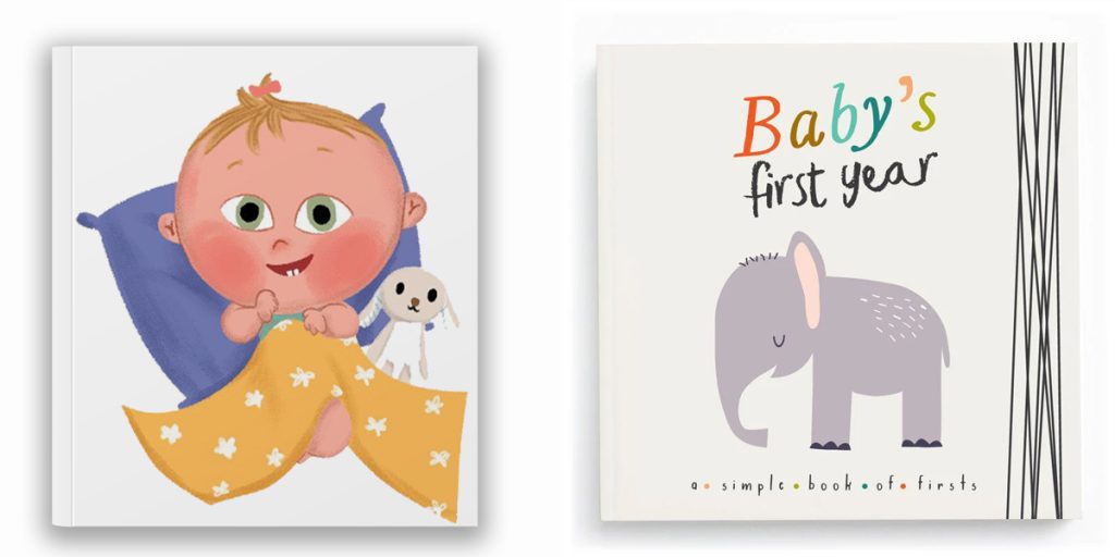
High contrast, few colors, strong separation between the subject and the background. Babies and toddlers are still developing color discrimination, and busy backgrounds genuinely cost them the ability to find the character. Four or five colors is plenty. Board books earn their boldness.
Ages 3 to 5
Saturated and warm, but with more going on. This is the age where children start hunting the page for small details, so a background can carry a second layer of interest. Keep the character reading clearly against whatever is behind them.
Ages 6 to 8
Now color can do emotional work the text does not state. Early readers will accept a muted page because a character is sad, and they will notice the brightness return. You can use a wider range and more subtlety, and you can start shifting palette by scene.
Ages 8 to 12
Close to adult sophistication. Limited, deliberate palettes read as serious rather than dull. Middle grade illustration can carry atmosphere, restraint, and color that contradicts the text for effect.
Color psychology, honestly
You will find a great deal written about what each color means. Some of it is useful and some of it is overstated, so here is the honest version.
Broad associations do hold up reasonably well: warm colors read as energetic and immediate, cool colors as calm or distant, dark and desaturated as serious or sad. These are worth using.
What does not hold up is the precise claims. Red does not reliably make a child excited, and blue does not reliably calm anyone down. Color meaning is heavily cultural and heavily contextual, and the same red reads as danger in one scene and warmth in another. If a book publishes in several markets, it is worth checking that a color carrying symbolic weight in your story does not carry a different one elsewhere.
Use color psychology as a starting direction, not as a rulebook. What the color does in this story, on this page, next to these other colors is what matters.
Bright or soft? The real trade-off
This gets argued about as though one is correct. Neither is. They do different jobs.
Bright, saturated palettes grab attention, photograph well as thumbnails, and suit younger readers, humour, and action. They are also harder to sustain: a book that shouts on every page has nowhere to go when something exciting finally happens, and bright palettes tire the eye over a long read.
Soft, muted palettes suit bedtime books, gentle or emotional stories, and older readers. They hold up to repeated reading. The risk is online: a muted cover can disappear as a thumbnail on Amazon, which is where most self-published books are actually chosen.
Most good books do both. They establish a base palette and then break it deliberately at the two or three moments that matter.
The mistakes that actually damage books
Poor contrast between text and background
The most common and the most damaging. Text placed over a busy or mid-toned illustration becomes hard work, and a child who is still decoding words has no spare effort to give. Leave quiet areas in the artwork for text to sit in. This is a composition decision made at sketch stage, not a fix applied later.
Characters whose colors drift
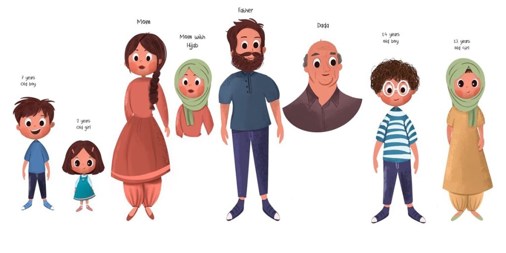
Over thirty-two pages, drawn over weeks, a character’s skin, hair and clothing will shift unless someone is holding them to a defined palette. Young readers notice. Professional studios solve this with a character sheet that fixes exact color values before any spread is painted.
Too many colors
A page with twelve competing colors has no focal point, and the reader’s eye has nowhere to land. Limiting the palette is almost always what separates a professional-looking spread from an amateur one.
Designing on screen and forgetting print
This one costs money. Screens are backlit and work in RGB; print is ink on paper and works in CMYK. Bright screen colors, especially vivid blues, greens and oranges, print duller than they looked. If the book is going to print, the palette should be chosen with that conversion in mind from the start, and a proof should be seen before the full run. We deliver print-ready files for Amazon KDP and IngramSpark precisely because this is where self-published books most often come unstuck.
Keeping color consistent across a whole book
Professional illustration handles this with two documents before the painting starts.
A character sheet fixes every recurring character’s colors, with specific values rather than descriptions, plus expressions and turnarounds. You can see how this works across our character design portfolio.
A color script maps the palette across the whole book as a row of small thumbnails, so you can see the emotional arc as color before committing to finished art. It is the cheapest moment to discover that your book is the same temperature from beginning to end.
Matching palette to subject
Different kinds of book settle into different color territory. Animal stories tend toward natural, earthy ranges with one or two heightened accents, which you can see in our animal illustration work. Fantasy carries more saturation and more invented color, since the world does not have to obey real light, as in our fantasy illustrations. Family and everyday stories usually sit warmer and softer, and classroom or school settings tend to need clarity more than atmosphere.
You can browse the full range by subject on our illustration portfolio.
How to brief color to your illustrator
You do not need to specify colors. You need to specify intentions, and let the illustrator solve them.
Useful to send: three or four published books whose feel you want, with a sentence on what you like about each. The emotional shape of your story, named per scene. Any color that carries meaning in the text. Where the book will be printed and sold. Any fixed brand colors if the book belongs to a series.
Not useful: a list of hex codes chosen without seeing the artwork, or a reference pulled from a different medium, such as a film still, which rarely translates to paper.
Where to start
Read your manuscript once, marking only where the mood changes. That list, and your reader’s age, is almost the whole palette brief. Everything else is a conversation with the person drawing it.
If you have a manuscript and want to know what it would look like in color, send it to us and we will come back with our reading of the palette along with the quote. Every illustration we produce is drawn by hand, with no AI, for readers aged 2 to 12. You can also see the full range of what we do on our services page.
Frequently asked questions
How many colors should a children’s book palette have?
For ages 0 to 3, four or five is usually right. Older readers can carry more, but most professional picture books work from a core of six to eight colors plus neutrals, with accents used sparingly.
Should I choose the colors or should my illustrator?
You should set the intention and the constraints. The illustrator should choose the actual colors, because palette decisions only work when they are made against the real artwork.
Will my colors look the same in print?
No, not exactly. Print uses CMYK ink and cannot reproduce every bright screen color, particularly vivid blues and greens. A well-prepared file accounts for this before printing, and a physical proof is worth the delay.
Does color affect whether a book sells?
Indirectly but genuinely, mostly through the cover. Most self-published children’s books are first seen as a small thumbnail, where contrast and simplicity matter far more than detail.
(mark up as FAQPage schema)
Ready to Bring Your Children's Book to Life?
Don't leave your story as just a draft. Led by an illustrator with more than fifty children’s books behind her, we handle character turnarounds, full-spread interior art, and print-ready publishing files for Amazon KDP, IngramSpark, EPUB and Barnes & Noble.
We do character design, storyboarding, book covers and complete books.