Color is one of the most powerful storytelling tools in children’s books—often speaking louder than words themselves. Before young readers even begin to understand text, they interpret emotions, actions, and meaning through colors on the page. The choice between bright tones and soft tones plays a defining role in shaping how children experience a story. Bright colors spark energy, excitement, and curiosity, while soft tones create feelings of calm, warmth, and emotional safety. Understanding how these styles impact young readers is essential for authors, illustrators, educators, and publishers who want their books to connect emotionally and visually.
Many creators find themselves asking, Which is better for children’s books: bold, vibrant colors or gentle, muted palettes? The truth is that neither approach is universally superior. Each serves a unique purpose depending on the target age group, story genre, emotional journey, and sensory needs of young readers. For toddlers and early learners, bright tones improve attention spans, object recognition, and color learning. For older children or bedtime readers, softer hues reduce stimulation, support longer reading sessions, and create immersive storytelling experiences that encourage reflection and emotional comfort.
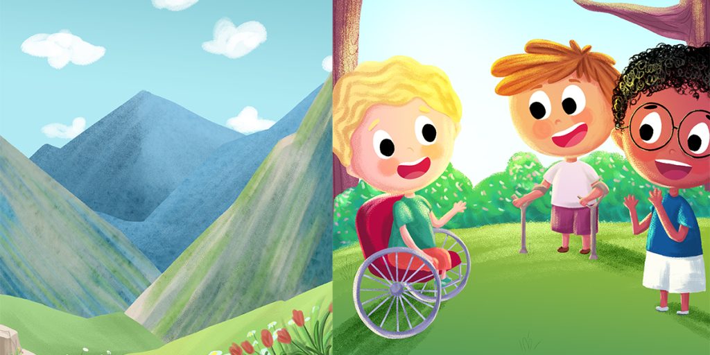
In today’s children’s publishing world, color choices are more strategic than ever. Market shelves are filled with eye-catching covers designed to stand out with bold palettes, while interior illustrations increasingly employ gentler tones to maintain visual flow and reading comfort. Some of the most successful modern children’s books blend both strategies—using vibrant highlights for key characters and moments while relying on softer backgrounds to maintain balance and readability.
This guide explores the psychological, educational, and marketing implications of bright versus soft tones in children’s book illustration. We’ll examine how each color style influences emotion, learning, focus, and shelf appeal, and which age groups benefit most from each approach. You’ll also discover professional tips for choosing tones based on story mood and how illustrators successfully combine both palettes for powerful hybrid designs. Whether you’re illustrating your first book or refining a visual concept, understanding these color dynamics will help you make confident decisions that elevate your storytelling and captivate young readers from the very first page.
Understanding Color Tones in Children’s Books
Color tones are a fundamental element of children’s book illustration, shaping how young readers interact with stories long before they understand the words. Bright tones are highly saturated, vivid colors—such as bold reds, sunny yellows, vibrant blues, and vivid greens—that instantly capture attention. These colors stand out on the page, creating excitement and stimulating curiosity. They are especially effective in early learning materials where visual clarity and strong contrast help toddlers recognize shapes, objects, and characters quickly.
In contrast, soft tones feature lower saturation and gentler contrasts. Palettes composed of pastels, muted earth hues, subtle watercolor blues, and warm cream neutrals evoke calmness and emotional warmth. Rather than demanding attention, soft tones guide the eye softly through illustrations, encouraging immersion and relaxed engagement. They support storytelling environments that feel safe, comforting, and emotionally connected—qualities particularly beneficial for bedtime stories or longer reading sessions.
Choosing between bright and soft color tones is not simply a stylistic preference; it significantly influences how young readers experience a book. Tone selection affects several key factors, including sensory stimulation levels, determining whether a page feels energizing or soothing. It shapes mood perception, setting emotional expectations for scenes and characters. Color tones also influence reading focus and eye comfort, helping maintain attention without overstimulation or fatigue. Finally, they contribute to memory retention, as consistent, harmonious palettes strengthen emotional and visual recall.
In essence, bright tones generate visual excitement and immediate engagement, while soft tones promote emotional comfort and deeper story connection. Understanding this balance empowers illustrators and authors to choose palettes that best support their storytelling goals and young audiences’ developmental needs.
The Psychology of Bright Tones
Emotional Impact
Bright colors stimulate excitement, curiosity, and joy. They activate visual attention quickly—essential for attracting very young readers whose attention spans are short. High-energy hues support stories built around playfulness, laughter, and exploration.
Learning & Recognition Benefits
Bright tones especially benefit early learning development:
- Improve object recognition
- Encourage color identification
- Strengthen shape differentiation
- Enhance memory association
When children see bold visuals, their brains associate color with learning concepts faster.
Also Read:Popular Color Styles in Modern Children’s Books
Best Age Ranges for Bright Palettes
Bright tones work best for:
- Ages 1–5
- Toddlers and preschool learners
- Early concept storytelling
Young children benefit from strong visual cues that don’t blend together.
Book Types That Benefit from Bright Colors
Bright tones shine especially in:
- Alphabet and number books
- Educational flashcard books
- Silly humor stories
- Action-based adventures
- Activity or puzzle books
Bright color contrast boosts comprehension, helping children locate characters and understand scenes quickly.
The Psychology of Soft Tones
Emotional Impact
Soft tones encourage calmness and emotional connection. They’re commonly used for stories centered on relationships, reflection, or emotional growth. Gentle color transitions improve visual comfort and reduce overstimulation.
Focus & Story Immersion
Soft palettes enhance storytelling immersion by minimizing visual distractions. Rather than pulling focus toward individual colors, children remain engaged with characters, plot flow, and emotional themes.
This is ideal for:
- Extended reading sessions
- Emotional narratives
- Independent reading models
Also Read:Color Themes That Make Children’s Books Stand Out
Best Age Ranges for Soft Palettes
Soft tones resonate with:
- Ages 6–10
- Emotionally sensitive readers
- Neurodivergent learners
- Bedtime readers
Their developing visual systems appreciate reduced brightness as attention shifts from visual discovery to meaningful psychological engagement with stories.
Book Types That Benefit from Soft Colors
Soft tones suit:
- Bedtime stories
- Friendship narratives
- Emotional learning books
- Gentle fantasy tales
- Middle-grade character stories
These palettes support relaxation while emphasizing emotional storytelling over visual intensity.
Comparing Bright vs Soft Tones
Eye Comfort
| Aspect | Bright Tones | Soft Tones |
|---|---|---|
| Visual Stimulation | High | Moderate |
| Eye Strain | Higher | Lower |
| Reading Duration | Short sessions | Long sessions |
Bright colors are exciting but may fatigue sensitive readers. Soft tones support longer reading periods.
Emotional Resonance
- Bright tones evoke excitement, happiness, and curiosity
- Soft tones convey calmness, gentleness, and emotional warmth
Both emotional pathways are valuable but serve different storytelling needs.
Also Read:Children’s Book Color Palette: How to Choose the Right Colors for Your Story
Shelf & Marketing Appeal
Bright covers:
- Stand out strongly on crowded book shelves
- Perform well on thumbnails and marketplaces
Soft covers:
- Appeal to parents seeking emotional or bedtime content
- Offer artistic sophistication
Marketing trends now use bold covers with softer interior palettes.
How to Choose the Best Tone for Your Children’s Book
Consider Your Target Age Group
Ages 1–4:
- Dominant bright palettes with high contrast
Ages 5–7:
- Mixed strategies blending bold and mellow colors
Ages 8–10+:
- Softer layered palettes or watercolor themes
Match the Story Mood
Mood alignment ensures storytelling coherence:
- Joyful / Humorous → Bright tones
- Reflective / Emotional → Soft tones
- Fantasy → Jewel tones softened by gradients
- Educational → Bright subject colors with soft backgrounds
Blending Bright and Soft Palettes
Modern illustrators increasingly favor hybrid color strategies.
- Bright characters on soft backgrounds
- Accent highlights layered onto pastel scenes
- Emotional lighting effects shifting brightness within scenes
This technique retains attention while promoting comfort.
Common Color Tone Mistakes to Avoid
- Over-saturation: too many neon accents overwhelm young readers.
- Low contrast: characters blending into backgrounds cause confusion.
- Ignoring sensory sensitivities: overly bright books may distress neurodivergent or sensitive children.
- Inconsistent tone: wildly shifting palettes disrupt story continuity.
Professional Illustrator Tips on Tone Selection
Character Color Anchoring
Main characters usually have 1–2 dominant anchor colors maintained throughout the book for recognition consistency.
Background Saturation Rules
Backgrounds should remain 10–30% softer than foreground characters to guide viewer focus naturally.
Accent Balancing
Accent colors should represent 10% or less of page coverage for emphasis—not clutter.
They highlight:
✓ Magic details
✓ Emotional reactions
✓ Scene shifts
Conclusion
The choice between bright and soft tones in children’s books is not about picking one option as better than the other. It is about using color with clear intent to support the story. Bright tones bring energy, support early learning, and grab attention quickly. This makes them a strong fit for toddlers, educational titles, and fast-paced, playful stories. Soft tones, by contrast, create a calmer reading experience. They support emotional connection and visual comfort, which works well for longer reading sessions, bedtime stories, and older children.
At The Rainbow Stories, color choices are guided by the reader’s age, the emotional direction of the story, and how the narrative flows from page to page. When color reflects both the mood of the story and the needs of the child, illustrations do more than decorate the page. They help children follow the story, connect with characters, and stay engaged.
Frequently Ask Questions
Is brighter always better for kids?
No. While bright palettes engage toddlers effectively, older readers benefit from calmer visual tones that enhance focus and emotional storytelling.
Can soft tones still attract readers?
Yes. Soft colors convey emotional depth and often outperform bright books in bedtime and emotional learning categories.
Should scenes change tone by emotion?
Yes. Gradual shifts in brightness support visual storytelling just as dialogue and plot shifts shape narrative arcs.
Do tone choices affect print quality?
Yes. Overly vivid neon colors can print harshly, while muted palettes maintain clarity and softness across print formats.
Can both styles work within one book?
Absolutely. Hybrid palettes produce strong visual engagement when transitions remain consistent and intentional.