Color is one of the very first elements children notice when they open a book. Before they read words or understand sentences, they experience the story through visuals—especially color. The right color choices help set the mood, guide attention across the page, build emotional connections with characters, and enhance memory retention. In children’s book design, color is not decoration; it is an essential storytelling tool.
However, many beautifully written books struggle to engage young readers simply because of poor color decisions. Overly bright palettes cause eye strain. Low contrast between text and background makes reading difficult. Inconsistent character colors confuse visual recognition. These mistakes can silently reduce a child’s reading comfort and emotional attachment to the story.
Designing for children requires more than personal taste or following trends. It demands an understanding of child development, color psychology, accessibility needs, print behavior, and visual balance. When these factors are ignored, illustrations fail to support the story—and may even distract from it.
In this guide, we uncover the most common color mistakes to avoid when designing a children’s book. You will learn how to select age-appropriate palettes, balance brightness with calm tones, improve readability through contrast, and maintain visual consistency. With these proven design principles, your book can become both visually beautiful and genuinely reader-friendly.
Why Color Choices Matter in Children’s Books
Children’s brains process visuals faster than text. Before young readers understand words, they experience stories through color, shape, and character expression.
Color influences:
- Mood — Brights feel exciting; soft tones feel calm.
- Memory — Consistent palettes help children remember scenes and characters.
- Attention — Good contrast guides where eyes move on the page.
- Emotion — Warm tones feel friendly; cool tones feel quiet or lonely.
Age also plays a major role. Toddlers respond to bold contrasts, while older children prefer more nuanced shades. Designing without considering these developmental differences often leads to visual disconnect.
Also Read:How Color Impacts a Child’s Reading Experience
Using Colors That Are Too Bright or Over-Saturated
One of the most common mistakes is filling every page with super bright or neon colors.
While bright colors grab attention at first, too much saturation overwhelms the eyes, leading to faster reading fatigue and shorter attention spans. Young readers may struggle to focus on key visual elements when everything screams for attention at once.
Over-saturation also limits emotional storytelling. Soft scenes or serious moments lose impact when painted with overly loud hues.
Better approach:
- Soften saturation for backgrounds.
- Use bright colors only for focal elements like characters.
- Allow tonal variation so the page can breathe visually.
Balance is key—excitement should never come at the cost of comfort.
Poor Contrast Between Text and Background
Another serious mistake is placing text over backgrounds without enough contrast.
Examples include:
- Light text on pale skies
- Dark text on heavy shadows
- Busy patterns beneath dialogue
These issues severely affect readability, especially for early readers whose eyes are still developing.
Children struggle to distinguish letters when contrast is weak. This discourages independent reading and causes frustration.
Best practice:
- Keep text areas on solid, light backgrounds.
- Avoid placing text directly over textured images.
- Use strong color contrast ratios for maximum clarity.
Readability always comes before artistic style.
Also Read:Bright vs. Soft Tones: What Works Best for Children’s Books?
Ignoring Age-Specific Color Preferences
Every age group responds differently to color.
Toddlers (0–3 years)
They prefer bold, simple colors with strong contrast.
Preschoolers (3–5 years)
They enjoy playful palettes with softer blends.
Early readers (6–8 years)
They engage with more complex color combinations and scene detail.
Middle grade (8–12 years)
They appreciate realistic tonal depth and mood-driven palettes.
Using toddler-style neon in a middle-grade story can appear immature, while dull realism in board books may fail to maintain child interest.
Match your palette to your audience’s emotional and cognitive stage.
Overusing Too Many Colors at Once
Visual chaos is a common design error.
When every object has a unique hue, children lose sight of where to focus. A cluttered palette distracts from storytelling and weakens emotional connection.
Professional illustration follows a simple rule:
One base color family
Two–three supporting accent colors
Neutral tones for balance
This approach establishes hierarchy and guides viewer attention naturally.
Limited palettes provide:
- Clear storytelling focus
- Better scene coherence
- Visual calm
More colors do not equal better design—clarity always wins.
Failing to Maintain Color Consistency
Inconsistent coloring breaks immersion quickly.
Common issues include:
- Characters wearing different shades between scenes
- Skin tones shifting slightly from page to page
- Environmental colors changing without narrative reason
Children recognize visual inconsistencies immediately. When characters visually “change,” the connection feels broken, and readers subconsciously disengage.
Solution:
- Establish a fixed character color bible.
- Save palette swatches digitally.
- Reuse exact values across all scenes.
Consistency builds familiarity—and familiarity builds trust.
Forgetting Color Symbolism and Cultural Meanings
Colors carry emotional meaning that varies across cultures.
For example:
- Red → energy, danger, excitement
- White → innocence in Western cultures, mourning in some Eastern cultures
- Green → growth, nature, healing
- Black → mystery, loss, or fear
Ignoring symbolism can create emotional confusion or cultural miscommunication.
Designers must consider where their books will be read. A global audience requires neutral symbolism and thoughtful palette decisions to ensure emotional tones remain universally understood.
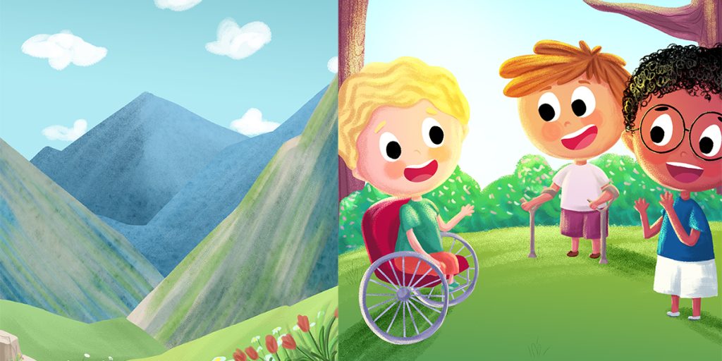
Ignoring Accessibility for Color-Blind Readers
About 1 in 12 children experience some form of color blindness.
Books relying solely on color differences—such as red vs green contrasts—can unintentionally exclude these readers.
Accessible design includes:
- Strong tone contrast, not just hue contrast.
- Adding patterns or shapes alongside color cues.
- Avoiding confusing color pairings.
Designing inclusively ensures every child can enjoy your story fully.
Not Testing Colors Across Print Formats
Colors visible on screens can shift dramatically once printed.
Designers often forget:
- RGB colors look brighter onscreen.
- CMYK printing dulls some vibrant tones.
- Paper finish (glossy or matte) alters final color appearance.
Without proofs, pages may come out darker or flatter than intended.
Always test:
- Home proofs
- Professional printer samples
- Mixed lighting checks
Print consistency ensures your hard work translates perfectly from screen to page.
Copying Trend Colors Instead of Story-Based Palettes
Color trends change fast.
One year favors pastels; next year favors muted tones or bold neons. Blindly following trends risks making your book visually outdated before its shelf life even begins.
Story always comes first.
Palette selection must reflect:
- Story genre (fantasy, educational, emotional)
- Mood arcs
- Character personalities
Let narrative tone drive color—not popular Pinterest boards.
Underusing Neutral and Background Colors
Many designers avoid whites, creams, greys, or soft pastels, fearing dullness.
This is a mistake.
Neutrals provide:
- Rest points for the eyes
- Space between visual elements
- Contrast that makes characters shine
Without neutrals, pages feel heavy and crowded. Strategic backgrounds give stories visual breathing room.
How to Choose the Right Color Palette for Your Children’s Book
Follow this simple process:
- Define your story mood (adventurous, calm, playful, emotional).
- Match colors to your target age group.
- Select 3–5 core colors.
- Add 1–2 gentle neutral shades.
- Test for contrast and readability.
- Print sample pages for real-world review.
This system ensures aesthetic beauty plus usability.
Top Tools to Avoid Color Mistakes
Professional illustrators rely on:
- Adobe Color – Palette building and harmony testing.
- Coolors – Quick palette experimentation.
- Color Hunt – Community color inspirations.
- Contrast Checkers – Text readability compliance.
These tools simplify smart color decisions.
Quick Color Mistakes Checklist
- Over-saturated palettes
- Low text contrast
- Ignoring age group needs
- Chaos from too many colors
- Inconsistent characters
- Culturally confusing symbolism
- Inaccessible color use
- Untested print output
- Blind trend following
- No neutrals
Avoid these pitfalls to elevate your book’s visual quality instantly.
Conclusion
Color plays a vital role in shaping how children experience a story. When chosen thoughtfully, it enhances mood, supports learning, improves readability, and deepens emotional connection. Avoiding common mistakes such as over-saturation, low text contrast, inconsistent palettes, and ignoring accessibility ensures your illustrations stay clear, engaging, and age-appropriate.
Remember, effective children’s book design is not about using more colors—it is about using the right colors with balance and purpose. Let your story’s emotion guide your palette, maintain visual consistency across pages, and always test designs before printing. When color works in harmony with storytelling, your book becomes not only beautiful but also memorable—creating a reading experience that truly captivates young minds.
Need Professional Illustration & Color Design?
If you want expert guidance for book covers and illustration design, The Rainbow Stories specializes in creating child-focused visuals that balance storytelling, accessibility, and professional print standards.
Let your colors enhance your story—not overwhelm it.
Frequently Asked Questions
What colors work best for children’s book illustrations?
Balanced palettes using harmonious brights supported by calming neutrals produce the best visual results across most age groups.
Is high contrast important for kids’ books?
Yes. Strong contrast improves readability and visual comprehension for early readers.
How many colors should a children’s book palette include?
A well-designed palette contains 3–5 main colors plus subtle neutral shades for balance.
Do colors affect learning in children’s books?
Absolutely. Proper color use improves memory retention, emotional connection, and concentration during reading.
Are pastel colors good for children’s books?
Pastels work beautifully for calm or emotional themes, especially for preschool and early reader groups—but should be supported with good contrast.