Your illustrator sends the final spreads. On your screen the artwork glows. Then the proof copy arrives and the skin looks flatter, warmer, slightly muddy, and the shadows that gave your character’s face its shape have closed up into one dark mass.
The short answer: nothing has gone wrong with the art. A screen makes colour by emitting light; paper makes it by absorbing some and reflecting the rest. Deep and warm tones lose the most in that translation, which means skin, and darker skin most of all, because its modelling lives in the shadows. You cannot judge this from a monitor. You judge it from a physical proof, and there are specific things to look at when it arrives.
Two facts about KDP worth knowing before you start
Straight from Amazon KDP’s own guidance, because both affect how your artwork prints:
- Colour books are printed on white paper. Cream is available for black-and-white interiors only. So for a full-colour picture book, the warmer cream stock is not a choice you have to make. White is what you get, and white holds contrast better anyway.
- Ink and paper type are locked once the book is published. You can change a black-and-white book between cream, white and groundwood later. A colour book’s settings are fixed. That is a one-way door, and it is why the proof matters.
KDP recommends ordering a proof before you publish. For a picture book, treat that as mandatory rather than advisable.
Why skin takes the biggest hit
Flat areas of bright colour survive printing well. Skin is not a flat area of bright colour. It is a continuous gradient made of warm mid-tones with modelling in the darker end, and that is precisely the part of the range where print has least room to work.
Two things happen. Warm browns shift, usually towards something duller than the screen promised. And deep shadows crowd together, so the separation between a cheek in shadow and the jaw behind it, the thing that makes a face look three-dimensional, can disappear into a single dark shape.
It follows that the darker your character’s skin, the more of their modelling sits in the vulnerable part of the range, and the more carefully the artwork has to be built in the first place.
What a good illustrator does about it
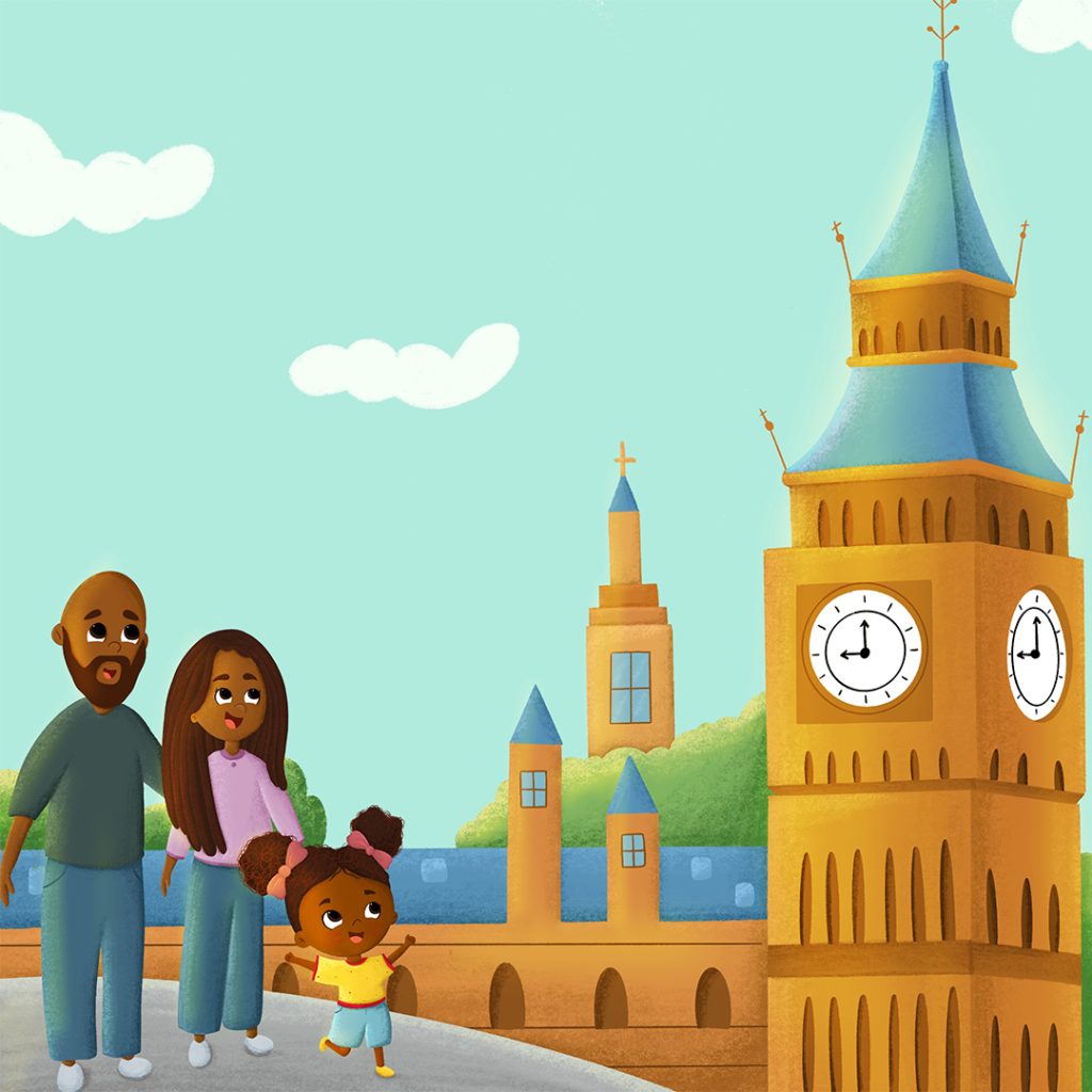
The work happens before printing, not after. Shadows on skin are built from colour rather than from black: a deeper, cooler version of the skin tone instead of a grey or near-black wash. That keeps separation in the dark end where print will squeeze it.
Highlights get kept honest too. A blown-out white highlight on a cheek looks fine on a backlit screen and can look like a hole in the face on paper.
What to check when your proof arrives
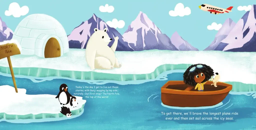
- Look at it in daylight, near a window, not under a warm indoor bulb. Household lighting is yellow and will mislead you about skin.
- Find the darkest-skinned character on their darkest page. Can you still see the shape of the face (cheek, jaw, brow) or has it gone flat?
- Check the same character across several spreads. Skin should read as the same person in a dark scene and a bright one.
- Look at faces against dark backgrounds. Night scenes are where separation is lost first.
- Compare two characters of different complexions in one scene. They should still read as distinctly different people.
- Ignore the screen while you do this. Comparing proof to monitor will only annoy you. They are different media and will never match.
If something is wrong
Tell your illustrator what you are seeing on paper, not what you expected to see on screen. “Her face goes flat on the night spread” is a fixable note. “The colours look off” is not. Specific, page-numbered observations from a physical copy get fixed quickly; vague ones produce a round of changes that solves nothing.
And order a second proof after the fix. It is a few dollars and a few days against a book you cannot change once it is live.
Related reading
For the wider question of getting a Black character drawn well, covering skin, hair, features and consistency, see African American children’s book illustration: how to get your characters drawn right. For briefing the hair specifically, see drawing Black hair in children’s books.
Frequently asked questions
Why does my children’s book look different in print than on screen?
A screen emits light and paper reflects it, so the two render colour differently. Deep and warm tones shift most, which is why skin and night scenes are usually where the difference is noticed first.
Can I use cream paper for a colour picture book on KDP?
No. KDP prints colour-ink books on white paper; cream is offered for black-and-white interiors. White also holds contrast better for illustration.
Can I change the paper type after publishing?
Not for a colour book. Ink and paper type are locked once it is published. Black-and-white paperbacks can be switched between cream, white and groundwood.
Do I really need a proof copy?
For an illustrated book, yes. It is the only way to see what your readers will see, and the settings cannot be changed afterwards.
How should I describe a colour problem to my illustrator?
By page number, from the printed copy, describing what you can and cannot see: for example “on page 14 her face loses its shape against the dark sky”.
Working on an illustrated book?
We draw complete children’s books and deliver print-ready files for Amazon KDP and IngramSpark. Tell us the page count and your deadline and we will come back with a firm quote, usually within one business day.
Ready to Bring Your Children's Book to Life?
Don't leave your story as just a draft. Led by an illustrator with more than fifty children’s books behind her, we handle character turnarounds, full-spread interior art, and print-ready publishing files for Amazon KDP, IngramSpark, EPUB and Barnes & Noble.
We do character design, storyboarding, book covers and complete books.